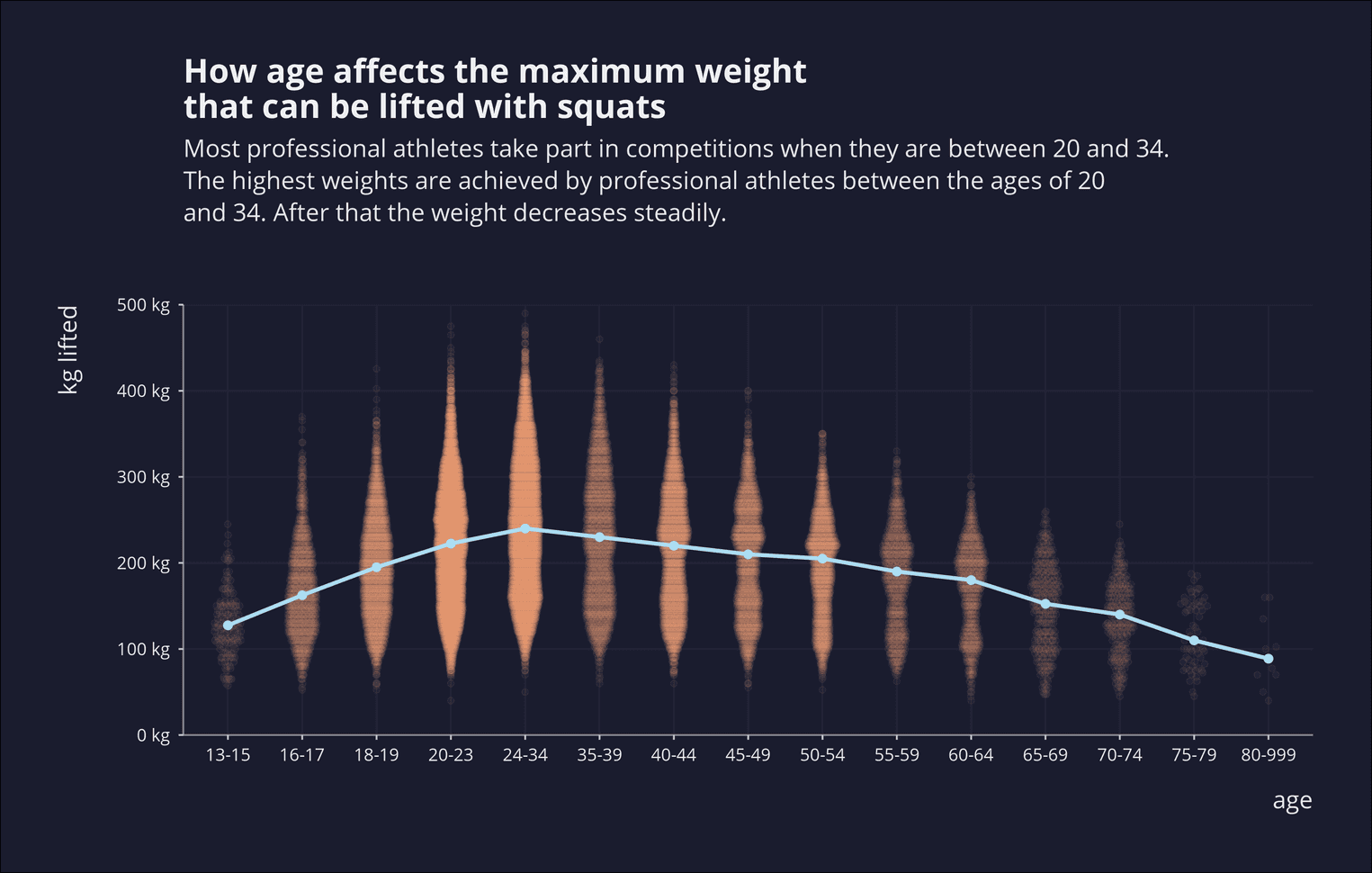
Anyone who has ever had a fitness trainer will know that squats and push-ups are the central exercises for strengthening the muscles. Wikipedia defines squats as follows: "A squat is a strength exercise in which the trainee lowers their hips from a standing position and then stands back up. During the descent of a squat, the hip and knee joints flex while the ankle joint dorsiflexes; conversely the hip and knee joints extend and the ankle joint plantarflexes when standing up."
In this tutorial you will find out how much weight professional athletes can lift with squats. You will also create a violin plot that shows how the athletes' maximum weight changes with age. The dataset for this tutorial is from the tidytuesday project.
Loading the dataset
First, as always, we load the libraries and the dataset. In order not to let the url become too long, we wrap it within the function paste0:
library(tidyverse)
library(lubridate)
library(scales)

lifts <- read_csv(paste0("https://raw.githubusercontent.com/",
  "rfordatascience/tidytuesday/master/data/2019/2019-10-08/ipf_lifts.csv"))
glimpse(lifts, width = 50)
Observations: 23,814
Variables: 17
$ name <chr> "Anna-Liisa Prinkkala"…
$ sex <chr> "F", "F", "F", "F", "F…
$ event <chr> "SBD", "SBD", "SBD", "…
$ equipment <chr> "Single-ply", "Single-…
$ age <dbl> 33.5, 34.5, 23.5, 27.5…
$ age_class <fct> 24-34, 24-34, 24-34, 2…
$ division <chr> "Open", "Open", "Open"…
$ bodyweight_kg <dbl> 44, 44, 44, 44, 44, 44…
$ weight_class_kg <chr> "44", "44", "44", "44"…
$ best3squat_kg <dbl> 135.0, 120.0, 130.0, 1…
$ best3bench_kg <dbl> 60.0, 62.5, 62.5, 60.0…
$ best3deadlift_kg <dbl> 145.0, 145.0, 120.0, 1…
$ place <chr> "1", "2", "3", "4", "5…
$ date <date> 1989-11-13, 1989-11-1…
$ federation <chr> "IPF", "IPF", "IPF", "…
$ meet_name <chr> "World Powerlifting Ch…
$ year <dbl> 1989, 1989, 1989, 1989…In total, the data set contains 23814 rows and 17 variables. In this tutorial we are particularly interested in the variables age_class and best3squat_kg. We could also have used the variable age to map the age, but you will soon realize that this would have made the visualization too complex. Instead, we'll display the age in age classes on the x-axis later. This also makes more sense, as athletes usually compete in age groups and are rated according to their age group.
Create the violin plot
You probably know boxplots. Boxplots are often not understandable for the statistical layman. Boxplots were designed in 1970 by John Tukey, at a time when data visualizations were still drawn by hand. With better computer performance, it is now possible to create more understandable visualizations, such as violin plots. Violin plots indicate the highest and lowest values of a distribution. At the same time, they also display the distribution of the data itself. You can imagine violin plots as inverted and mirrored histograms. Violin plots should only be used if there are enough data points to visualize a distribution, otherwise violin plots lead to false conclusions. In our case this is not a problem because we have many data points. Next we create the violin plot. On the x-axis is the age group and on the y-axis the highest weight the athletes could lift.
lifts %>%
  ggplot(aes(x = age_class, y = best3squat_kg)) +
  geom_jitter(alpha = .05) +
  geom_violin(alpha = .9, draw_quantiles = c(0.5))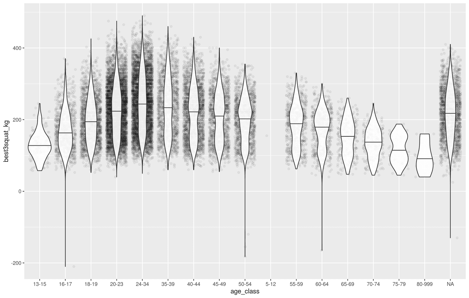
You see that with increasing age the maximum weight of the athletes increases. From the age group 24 to 34, however, the maximum weight decreases steadily. We have added two visualizations to the visualizations. With geom_jitter we have scattered the individual points according to age group. We also added geom_violin to the violin plot. The visualization still has some problems. First we see that there are no athletes in the age group between 5 and 12 years. We also have a lot of NA values. Let's try to solve both problems by removing both values from the data:
lifts <- lifts %>%
  mutate(
    age_class = age_class %>% as.factor
  ) %>%
  filter(!age_class == "5-12") %>%
  drop_na(age_class)
lifts %>%
ggplot(aes(x = age_class, y = best3squat_kg)) +
geom_jitter(alpha = .05) +
geom_violin(alpha = .9, draw_quantiles = c(0.5))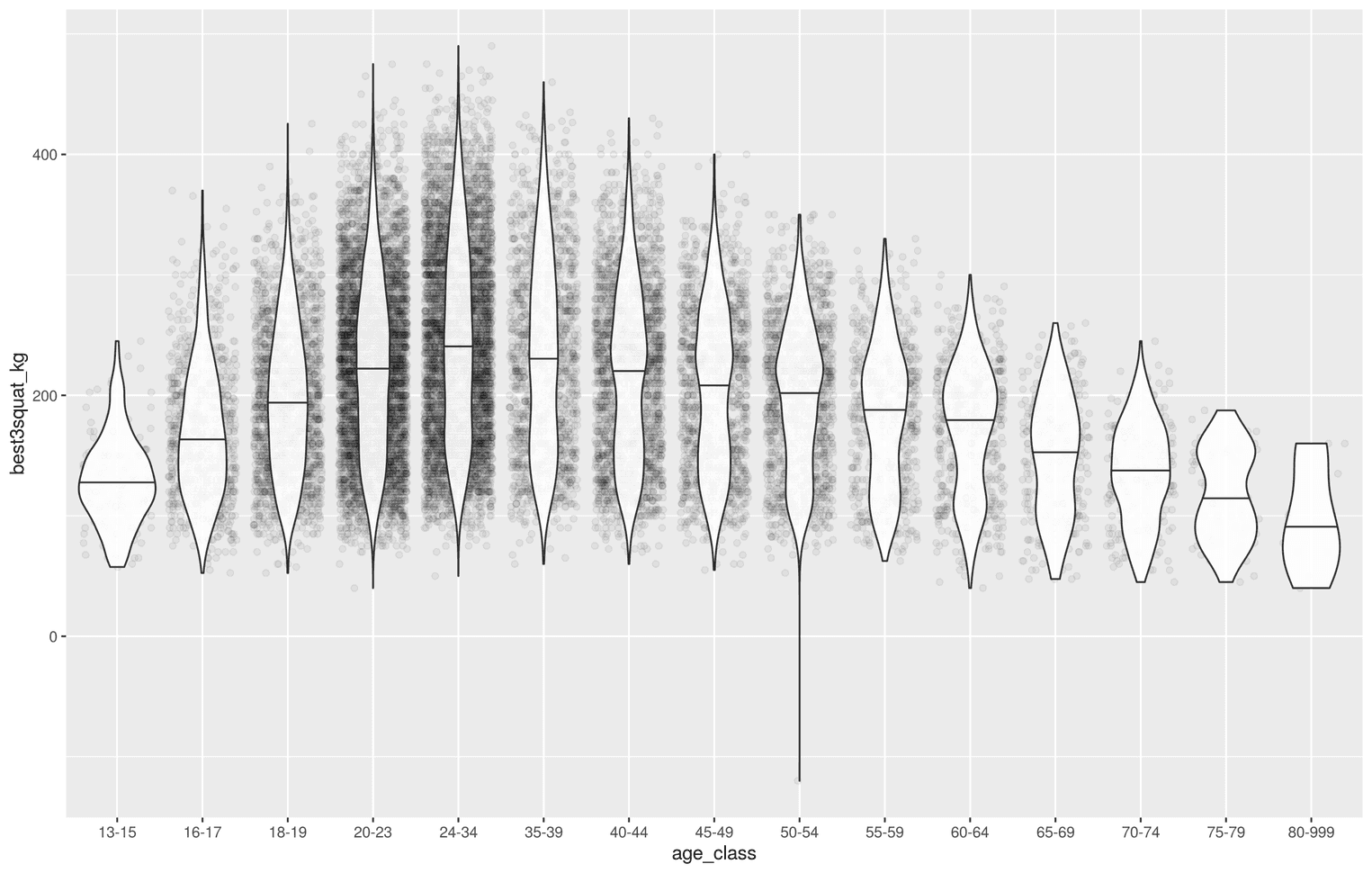
drop_na is a very handy function to filter missing values from a data set. We used drop_na() at this point to remove all rows that have an NA in the age_class variable.
However, the visualization has other problems. The most central problem is that the individual points of geom_jitter do not stop at the edge of the violin plots, but go beyond them. Readers might wonder why the points are not within the violin plot. It would therefore be useful to map the points within the violin plot. This problem was already experienced by [others] (https://stackoverflow.com/questions/51069955/restrain-scattered-jitter-points-within-a-violin-plot-by-ggplot2). We can solve the problem by using the package ggbeeswarm, which allows us to display the points as a violin plot . Let's try exactly that:
# install.packages("beeswarm")library(ggbeeswarm)
lifts %>%
  ggplot(aes(x = age_class, y = best3squat_kg)) +
  geom_quasirandom(alpha = 0.05, width = 0.2)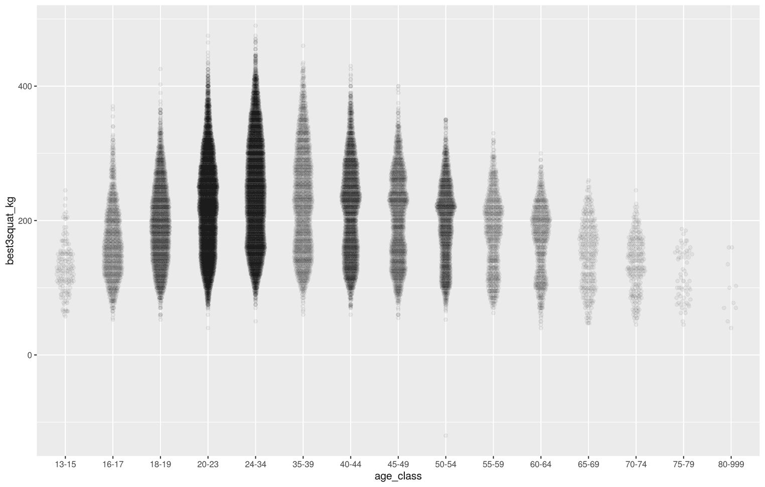
Now the violin plot allows us to see several things at once. On the one hand we can see how many athletes have competed in one age group. In addition, we can see the distributions better, because the points take the shape of the violin plot.
Adding the trend line
Readers who now look at the visualization can guess the trend of the data, namely that the maximum weight rises up to the age group 24-34, but then sinks down again. However, the trend is difficult to see at first glance, as the data at the lower end are at the same horizontal level and thus visually weaken the trend. We can solve this problem by adding the median as a trend line to the data. Let's do that once and then I'll explain how we did it:
lifts %>%
  ggplot(aes(x = age_class, y = best3squat_kg)) +
  geom_quasirandom(alpha = 0.05, width = 0.2) +
  stat_summary(fun.y = "median", geom = "point", size = 2) +  stat_summary(fun.y = "median", geom = "line", aes(group = 1),               size = 1.1)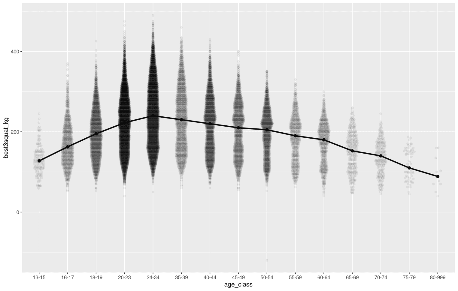
We did the trick with the function stat_summary. With the help of stat_summary you can calculate characteristic values for individual groups in a visualization and display different visualizations with Hlife (for more information look here). In this case we have shown the median as points as well as a line. If you compare this visualization with the previous one, you will immediately notice that the trend is much easier to recognize.
Adjusting the y-axis
Readers should recognize as quickly as possible what is represented on the axes. We know that the y-axis represents the maximum weight in kg. It would therefore be a good idea to display exactly this unit of measurement. Let's do that:
library(scales)
lifts %>%
  ggplot(aes(x = age_class, y = best3squat_kg)) +
  geom_quasirandom(alpha = 0.05, width = 0.2) +
  stat_summary(fun.y = "median", geom = "point", size = 2) +
  stat_summary(fun.y = "median", geom = "line", aes(group = 1),
               size = 1.1) +
scale_y_continuous(limits = c(0, 500), expand = c(0, 0), labels = scales::unit_format(unit = "kg")) 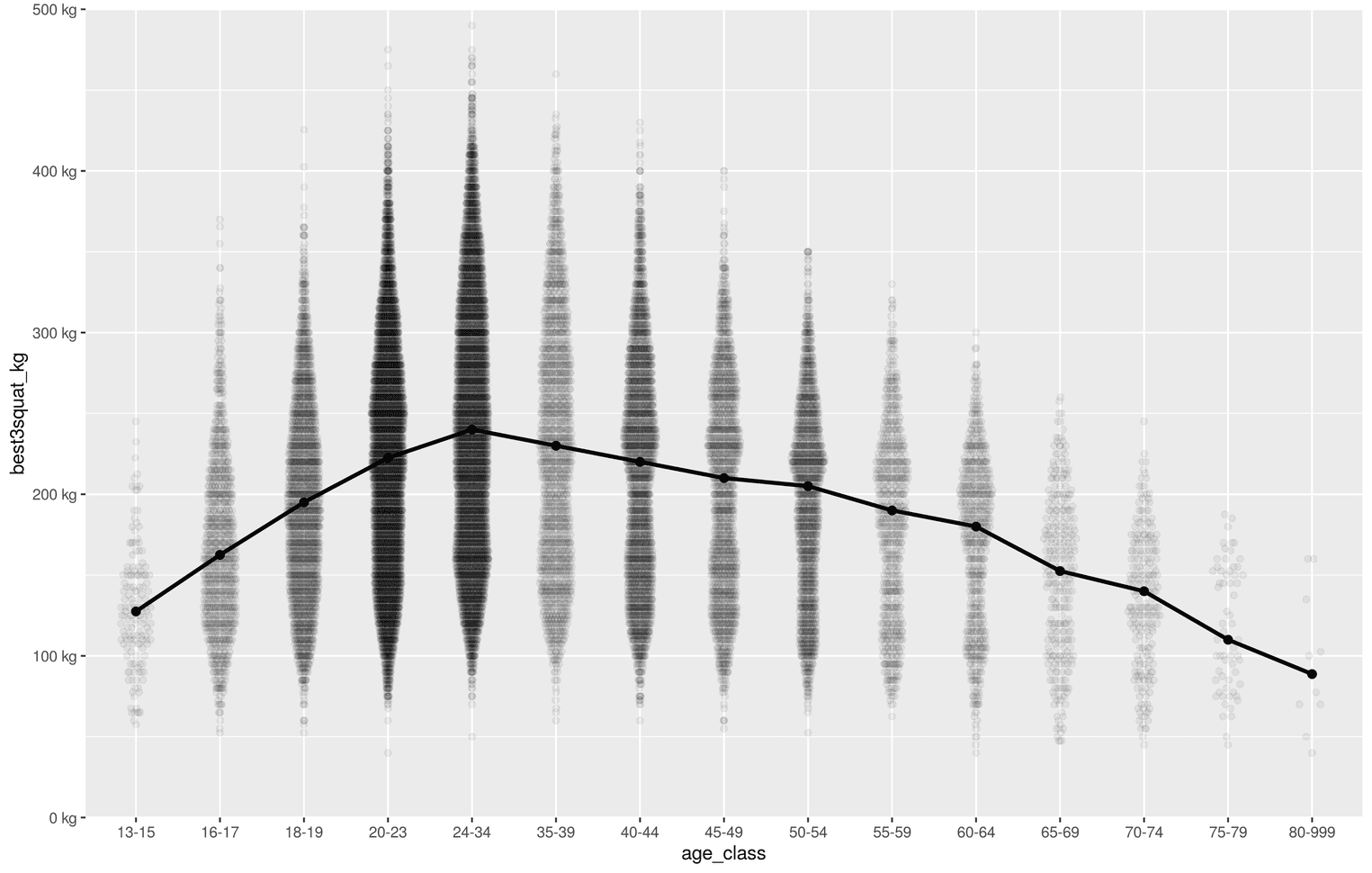
Several things have changed now. First, we have defined the length of the visualization from 0 to 500 (limits = c(0, 500)). It would be absurd to display values below 0 kilograms on the y-axis. With expand = c(0, 0) we made sure that the y-axis starts at exactly 0 kilogram. ggplot usually adds a kind of margin. I added the label "kg" with the help of the package scales. A short tutorial can be found here.
Add labels
The next step is straightforward. We still need a meaningful title, a subtitle and axes labels. We can do this with the function labs:
lifts %>%
  ggplot(aes(x = age_class, y = best3squat_kg)) +
  geom_quasirandom(alpha = 0.05, width = 0.2) +
  stat_summary(fun.y = "median", geom = "point", size = 2) +
  stat_summary(fun.y = "median", geom = "line", aes(group = 1),
               size = 1.1) +
  scale_y_continuous(limits = c(0, 500),
                     expand = c(0, 0),
                     labels = scales::unit_format(unit = "kg")) +
labs( title = "How age affects the maximum weight\nthat can be lifted with squats", subtitle = paste0("Most professional athletes take part in competitions", " when they are between 20 and 34.\nThe ", "highest weights are achieved by professional ", "athletes between the ages of 20\nand 34. After ", "that the weight decreases steadily."), x = "age", y = "kg lifted" ) 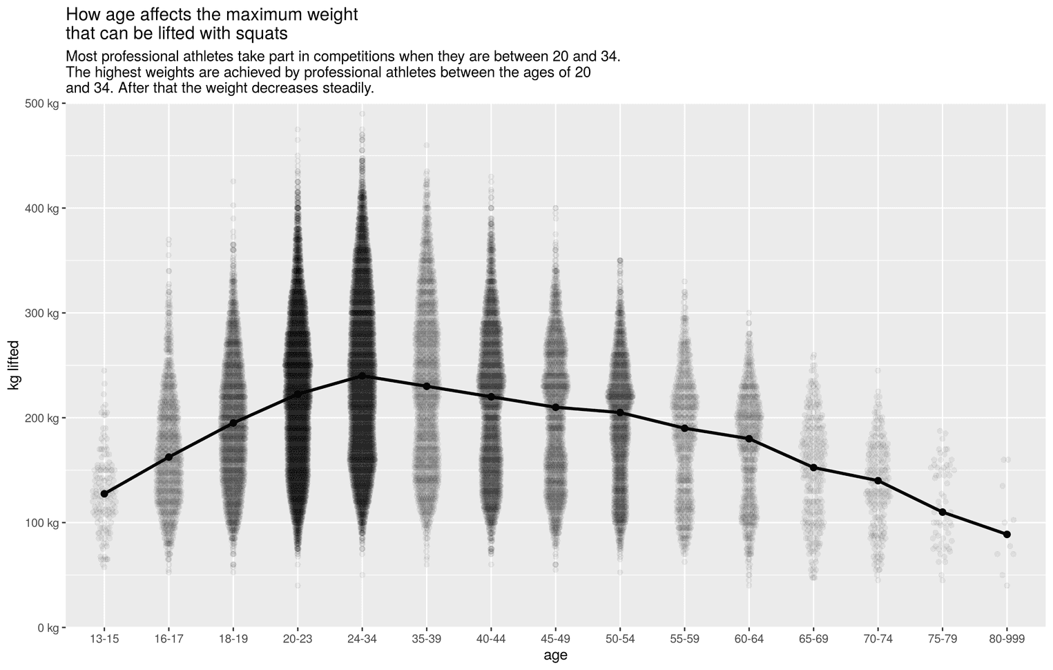
Improve the visual appearance
A central principle in design is: "Get it right in black and white". In the next step we will try to make the visualization more appealing by changing the font size and giving the individual elements more padding:
lifts %>%
  ggplot(aes(x = age_class, y = best3squat_kg)) +
  # Insert code from previous visualization here
  theme_minimal() +  theme(    text = element_text(family = "Open Sans"),    plot.margin = unit(rep(1.2, 4), "cm"),    plot.title = element_text(size = 19,                               face = "bold",                              margin = margin(b = 8)),    plot.subtitle = element_text(size = 14,                                  lineheight = 1.1,                                 margin = margin(b = 45)),    panel.grid.minor.x = element_blank(),    panel.grid.minor.y = element_blank(),    axis.text = element_text(size = 10),    axis.text.x = element_text(margin = margin(t = 5)),    axis.text.y = element_text(margin = margin(r = 5)),    axis.title = element_text(size = 14),    axis.title.y = element_text(margin = margin(r = 20),                                hjust = 1),    axis.ticks = element_line(),    axis.title.x = element_text(margin = margin(t = 15),                                hjust = 1),    axis.line = element_line()  )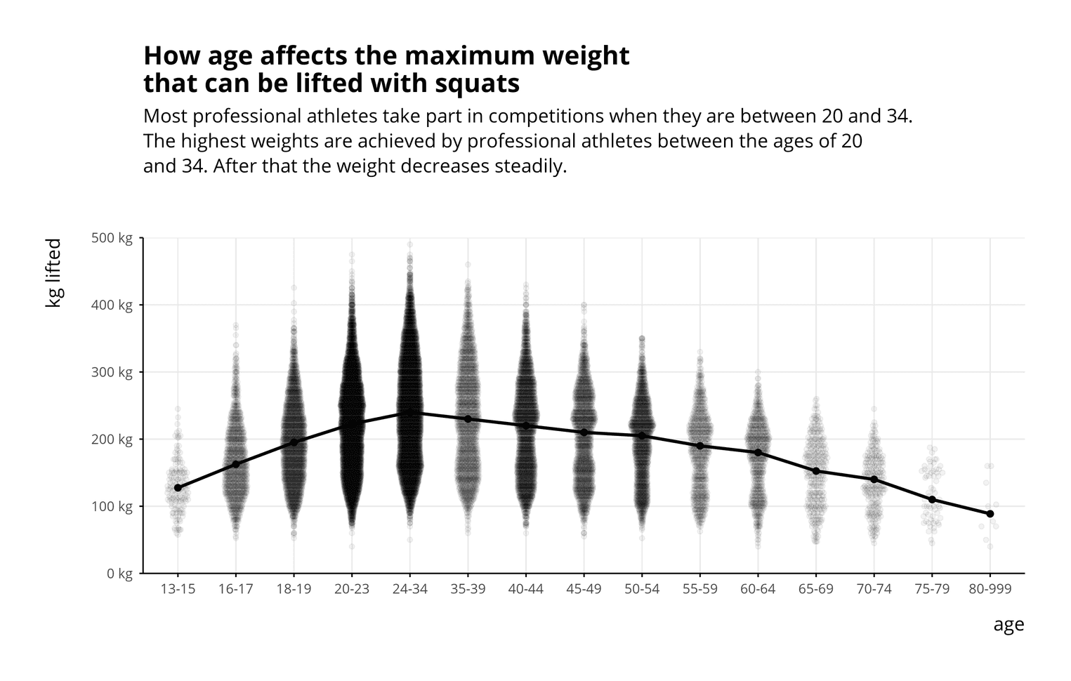
We have changed the appearance of the visualization with the function theme. The function is very complex, with it all elements of the visualization can be visually changed. If you are unsure what these elements do, you can insert each element of the theme function one after the other and see what changes in the visualization. For example, I used axis.line = element_line() to add lines to the axes. I also added a margin to the whole visualization to make it more relaxed (plot.margin = unit(rep(1.2, 4), "cm")).
Adding color to the violin plot
The visualization could be shown to people already now. But we can make it even more appealing with colors. For this we give the violin plot and the trend line a color.
lifts %>%
  ggplot(aes(x = age_class, y = best3squat_kg)) +
  geom_quasirandom(alpha = 0.05, width = 0.2,
                   color = "#eba487") +  stat_summary(fun.y = "median", geom = "point", size = 2,
               color = "#abdcf1") +  stat_summary(fun.y = "median", geom = "line", aes(group = 1),
               color = "#abdcf1",               size = 1.1) +
  scale_y_continuous(limits = c(0, 500),
                     expand = c(0, 0),
                     labels = scales::unit_format(unit = "kg")) +
  labs(
    title = "How age affects the maximum weight\nthat can be lifted with squats",
    subtitle = paste0("Most professional athletes take part in competitions",
                      " when they are between 20 and 34.\nThe ",
                      "highest weights are achieved by professional ",
                      "athletes between the ages of 20\nand 34. After ",
                      "that the weight decreases steadily."),
    x = "age",
    y = "kg lifted"
  ) +
  theme_minimal() +
  # theme function of previous plot goes here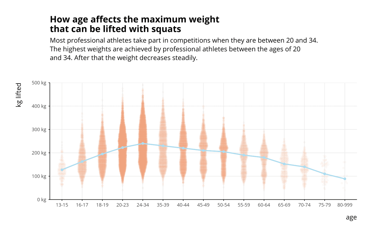
The colors don't have enough contrast yet. Since we will put a dark background behind the visualization, the contrast will increase in the last step.
Finishing the colors of the visualization
Finally, we create a dark visualization from our bright visualization to make the visualization more serious.
lifts %>%
  ggplot(aes(x = age_class, y = best3squat_kg)) +
  # functions of previous plots go here
  theme(
    text = element_text(family = "Open Sans"),
    plot.margin = unit(rep(1.2, 4), "cm"),
    plot.title = element_text(size = 19,
                              face = "bold",
                              color = "#f2f3f5",                              margin = margin(b = 8)),
    plot.background = element_rect(fill = "#1a1c2e"),    plot.subtitle = element_text(size = 14,
                                 lineheight = 1.1,
                                 color = "#e6e7eb",                                 margin = margin(b = 45)),
    panel.grid.minor.x = element_blank(),
    panel.grid.minor.y = element_blank(),
    panel.grid.major.y = element_line(color = "#21243a"),    panel.grid.major.x = element_line(color = "#21243a"),    axis.text = element_text(color = "#e6e7eb", size = 10),    axis.text.x = element_text(margin = margin(t = 5)),
    axis.text.y = element_text(margin = margin(r = 5)),
    axis.title = element_text(size = 14, color = "#e6e7eb"),    axis.title.y = element_text(margin = margin(r = 20),
                                hjust = 1),
    axis.ticks = element_line(color = "#c2c3cf"),    axis.title.x = element_text(margin = margin(t = 15),
                                hjust = 1),
    axis.line = element_line(color = "#878890")  )
That's it. The visualization now shows a clear trend and hopefully tells readers that age has a significant impact on the maximum weight of squats.
I hope you learned something from the tutorial.
