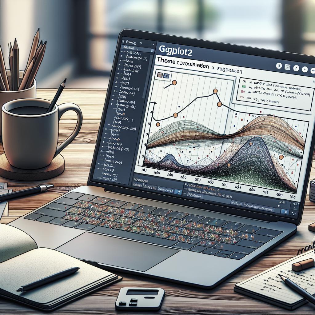
Customizing ggplot2 Themes: A Comprehensive Guide
Explore the versatile world of ggplot2 themes to enhance your data visualization projects with R. In this blog post, we delve into the myriad of customization options available to tailor your plots’ visual appeal. Topics include altering plot backgrounds, using minimalist themes, and applying themes inspired by renowned publications such as
The Economist
and
The Wall Street Journal
. Whether it’s using predefined themes or customizing specific elements like grid lines and backgrounds, this guide offers insights and inspiration. Perfect for those wanting to elevate their data presentations with style and functionality.
Change the colors of the plot panel background and the grid lines
The visual aesthetics of your plots can be significantly enhanced by altering the plot panel background and grid lines. Using ggplot2, these changes not only improve readability but also add a personal touch to your plots. The plot panel background is the area where the data points are displayed. Depending on your data and audience, you may choose a subtle color to ensure your plot content remains the focal point.
Grid lines serve as a reference point, aiding in data interpretation. By customizing the color of grid lines, you can enhance or soften their presence in your plot. This customization can be achieved using functions like
theme()
in ggplot2, where parameters such as
panel.background
and
panel.grid.major
allow for detailed color adjustments.
Remove plot panel borders and grid lines
For a cleaner and less cluttered visualization, removing plot panel borders and grid lines can be beneficial. This minimalist approach can make your data appear more pronounced and direct attention towards key plot elements. Using ggplot2, this can be easily accomplished by setting the border and grid elements to
element_blank()
.
By eliminating these visual cues, you place the emphasis squarely on the data, creating a modern, sleek visual experience. This style is particularly useful in presentations and reports, where space for interpretation might be limited and clarity is paramount.
Change the plot background color (not the panel)
Beyond the plot panel, you might want to address the overall plot background color to match a publication’s branding or to improve visual harmony. This involves changing the color surrounding the plot panel, which might be important for integrating your plot within a more extensive publication or report.
With ggplot2, this customization is managed using the
plot.background
option within the
theme()
function. By carefully selecting a background color that complements your plot’s data points and panel, you enhance the plot’s overall cohesion and aesthetic appeal.
theme_tufte: a minimalist theme
Inspired by Edward Tufte’s principles of data visualization, the
theme_tufte
offers an elegant, minimalist approach to plotting. Minimalism in data visualization is not about removing all elements but, rather, about removing non-essential ones to highlight the data itself.
In ggplot2,
theme_tufte()
eliminates distractions such as heavy grid lines and plot borders, and uses subtle cues like soft lines and understated fonts to support data comprehension. This makes it a preferred choice for academic publications and presentations where clarity and focus are sought after.
theme_economist: theme based on the plots in The Economist magazine
The
theme_economist
provides a style that emulates the sleek and professional appearance found in
The Economist
magazine. Known for their polished and informative graphs, this theme is ideal for those looking to present data with authority and clarity.
With this ggplot2 theme, you can achieve a professional look that includes distinct grid lines, specific color palettes, and formatting that aligns with The Economist’s standard. Such customizations enhance the reader’s ability to comprehend complex data quickly, which is crucial in business settings.
theme_stata: theme based on Stata graph schemes
For those familiar with Stata, this theme provides a similar aesthetic within the R environment using ggplot2. The
theme_stata
echoes Stata’s clean and straightforward graph style, appealing to users who transition frequently between the two software programs.
This theme reproduces Stata’s structured and uncluttered look, supporting a seamless aesthetic consistency across analyses conducted in both R and Stata. It’s especially useful in collaborative environments where data outputs need to match across different tools and platforms.
theme_wsj: theme based on plots in The Wall Street Journal
Emulating the design elements of The Wall Street Journal, the
theme_wsj
presents data in a way that is both sophisticated and readable. This theme delivers a subtle color scheme and unobtrusive grid lines, focusing on effective storytelling through data.
By adopting this style, your ggplot2 visualizations can reflect the high standards of journalistic data presentation. This is advantageous in delivering clear insights without overwhelming the audience, ideal for media-related data reports and business analytics.
theme_calc: theme based on LibreOffice Calc
The
theme_calc
mimics the graph appearance of LibreOffice Calc, catering to users who aim for a spreadsheet-like look in their plots. This theme can be particularly useful for users already familiar with LibreOffice Calc, making visual output interpretation intuitive and familiar.
This ggplot2 theme offers a cost-effective and open-source alternative to traditional spreadsheet applications, bringing with it a certain consistency and ease of integration into LibreOffice-filled workflows, especially in open-office environments or resource-conscious organizations.
theme_hc: theme based on Highcharts JS
The
theme_hc
aims to replicate the modern and interactive style of Highcharts JS. This theme benefits those looking for highly polished and state-of-the-art visualizations, often required in web-based data dashboards and presentations.
Highcharts is known for its sleek style and comprehensive functionality, and with
theme_hc
, you can bring this professional touch to your static ggplot2 visualizations. This theme helps align the visual output with high-tech and digital environments, closing the gap between static and interactive data visualization experiences.
Recommended for You!
-
Explore more:
Dive into the wide range of ggplot2 themes and functions available to further customize your plots beyond basics. -
Stay Updated:
Continuously check for theme updates and new releases that enhance functionality and aesthetic options.
Recommended for you
Books – Data Science
-
“R for Data Science” by Hadley Wickham and Garrett Grolemund
-
“The Art of Data Science” by Roger D. Peng and Elizabeth Matsui
-
“Practical Data Science with R” by Nina Zumel and John Mount
Final Thoughts
Embrace the full capabilities of ggplot2’s theme customization options to create impactful, visually appealing data visualizations. Whether leaning towards a minimalist, professional, or tech-savvy look, ggplot2 offers theme flexibility to fit any project’s needs.
| Themes | Description |
|---|---|
| Change Colors | Customize plot panel background and grid line colors. |
| Remove Borders | Achieve cleaner plots by removing panel borders and grid lines. |
| Background Color | Change the overall plot background color for better aesthetics. |
| Theme Tufte | Utilize a minimalist approach inspired by Edward Tufte. |
| Theme Economist | Create plots with a professional look akin to The Economist magazine. |
| Theme Stata | Mimic Stata’s graph schemes for consistent visual style. |
| Theme WSJ | Adopt The Wall Street Journal’s sophisticated plot style. |
| Theme Calc | Open-source appearance similar to LibreOffice Calc. |
| Theme HC | Inspired by the sleek style of Highcharts JS. |

