One of the most misunderstood concepts in statistics is the significance and power of a study. The concept of significance allows us to make statistical decisions. For example, we can use a significance test to test whether two learning methods differ in their effectiveness. If the probability of a certain group difference under the null hypothesis is less than 5%, we speak of a significant event and reject the null hypothesis in favor of the alternative hypothesis. In other words, we pretend that the null hypothesis is wrong given the data. This approach seems strange, however, if you imagine that there are always differences between groups. What interests us more is how big these differences are. The research question of whether there is a difference between two learning methods is therefore clear from the outset: There is always a difference.
Another peculiarity is the fact that the significance of a study depends on its sample size. The larger the sample size, the more likely it is that we will find a significant result and opt for the alternative hypothesis. No wonder students are confused about the concept. What good is the concept of significance if it doesn't give us the answer we are looking for, namely the size of the effect?
Students also need to learn about the concept of power, type I, and type II error. Power is the probability of getting a significant result. If we have high power, we can be confident that we will get a significant result given our alternative hypothesis is true. However, many studies in the social sciences are underpowered. Even if there is an effect we unlikely find it because we miss the power to do so. As a result, we are very likely to make a type II error: We reject the alternative hypothesis in favor of the null hypothesis.
How can we help students make sense of these confusing concepts? There are many approaches. For example, we could not focus on dichotomous thinking in statistical decision making and favor approaches that focus on effect sizes. We could also teach students to look more closely at confidence intervals. In this tutorial, however, we will stay in the world of null hypothesis significance testing and try to simulate p-value distributions.
This approach has many advantages. First, it will help students to realize that the power of a study can only be interpreted in the long run. A single experiment has no power. It is the replication of thousands of studies that allow the calculation of power. Second, visualizing p-values can help students understand the complicated relationship between power, significance and type I/II errors.
We will visualize p-value distributions for the independent t-test. In other words, we will try to find out if there is a group difference in peoples' intelligence. The idea for this tutorial comes from the wonderful course Improving your statistical inferences by Daniel Lakens. I took his idea and tried to recreate p-value distribution with the tidyverse and ggplot2 package.
To simulate p-value distributions, we will need two packages, tidyverse and cowplot:
library(tidyverse)
library(cowplot)
Visualizing p-value distributions
Imagine you want to figure out if two groups of people differ in their intelligence. For each of the two groups, you bring 30 people to the lab and let them fill out an intelligence test. You assume that group 1 is more intelligent that group 2. However, after five studies you did not get a statistically significant result. Why is that? Imagine for a second what would happen if both populations do not differ at all in their intelligence. In other words, your alternative hypothesis is wrong. What distribution of p-values would you expect?
To answer that question, we will write some code. First, we need a function that calculates a p-value per study. The function takes four arguments. It will take the intelligence of group 1 and group 2, the number of participants per group the standard deviation of their intelligence score. We then carry out an independent t-test and return the p-value for this test:
get_p_value <- function(M1, M2, n, sd) {
  M1 <- rnorm(n = n, mean = M1_control, sd = sd)
  M2 <- rnorm(n = n, mean = M2_treatment, sd = sd)

  t_test <- t.test(M2, M1, alternative = "greater")

  t_test$p.value
}
This function makes it easy to get a p-value for our independent t-test. In the next example, we assume that both groups have an intelligence score of 100. There will be 30 people in each group, and the standard deviation of their intelligence will be 15:
get_p_value(100, 100, 30, 15)[1] 0.7937846You will likely obtain a different p-value since to a certain extent they are due to chance. You will certainly draw a different sample from the population than I do. One sample is interesting, but we are more interested in several samples. To get many p-values we can use the function map or more precisely the function map_dbl from the package purrr. map_dbl takes a vector or a list and executes a function for each element of the vector or list. We will insert a vector with the ID of each study. For each study we will then execute the same function with the same arguments and store the p-value of each study. We will then visualize these p-values in the next step.
p_values <- c(1:4) %>%
  map_dbl(~ get_p_value(100, 100,
                        30, 15))
[1] 0.42080752 0.25262249 0.01381658 0.32644962In the upper example, we conducted four studies and calculated the p-value for each study. Now we have all the elements to visualize p-values. I will first show you the full visualization, we will then explain it in more detail:
nSims <- 20000 # number of simulations
n <- 30 # sample size

# Get p-values
p_values <- c(1:nSims) %>%
  map_dbl(~ get_p_value(M1 = 100, M2 = 100,
                        n = 30, sd = 15))

# Calculate power of all studies
power <- (sum(p_values < 0.05) / nSims)

# p-distribution
ggplot(NULL, aes(x = p_values)) +
  geom_histogram(binwidth = .05, fill = "grey80",
                 color = "black", boundary = 0) +
  labs(
    title = paste0("p-distribution with ",
                   nSims, " studies; type I error: ", round(power * 100, 2), "%\n",
                   "correct statistical decision: ", round(100 - (power * 100), 2), "%",
                   "; n = ", n),
    x = "p-values",
    y = "frequency"
  ) +
  geom_vline(xintercept = .05, color = "red", linetype = "dashed") +
  scale_y_continuous(limits = c(0, nSims), expand = c(0, 0)) +
  scale_x_continuous(limits = c(0, 1), expand = c(0, 0),
                     breaks = seq(0, 1, by = 0.1)) +
  theme_minimal(base_size = 14) +
  theme(
    plot.margin = unit(rep(1.2, 4), "cm"),
    axis.title.x = element_text(margin = margin(t = 10)),
    axis.title.y = element_text(margin = margin(r = 10))
  )
Let's start by explaining the code. In the first two lines we define two variables that store the number of simulations and the sample size. We then calculate 20000 p-values for the same experiment. We assumed that group 1 and group 2 have the same intelligence score. Next, we calculate the power of the study. Power is defined as the probability of a significant result. Since a significant result occurs when the p-value is below 0.05, we can calculate those events and divide them by the number of simulations. To visualize the p-value distribution, we plot the p-values on the x-axis. We then added a geom_histogram. To fully understand the histogram, it is important to add a binsize of 0.05. Why? Because p-values range between 0 and 1. Since the alpha level is defined by 5% it makes sense to visualize 20 bins of size 0.05 each. If we would define another bin size we would be hard pressed to see the alpha level of 5%. It also important to add the argument boundary = 0. By default the bins are centered around the breaks in ggplot2. By setting the boundary to 0 the bins start on the very left of each break. Just try to remove this argument and see what changes. You will also see that we added a title that includes the power of the study, the type II error, the number of studies and the sample size. To do that we use the function paste0 which allows us to combine strings and numbers into one big string. Another highlight of the visualization is the base_size = 14 argument. Usually, the axis title and axis ticks are too small. With base_size we can easily make them larger to increase the readability of our visualization. The visualization also depicts the 5% value that defines our statistical decision. P-values left of the red dashed line lead to a significant result, p-values to the right to a non-significant result.
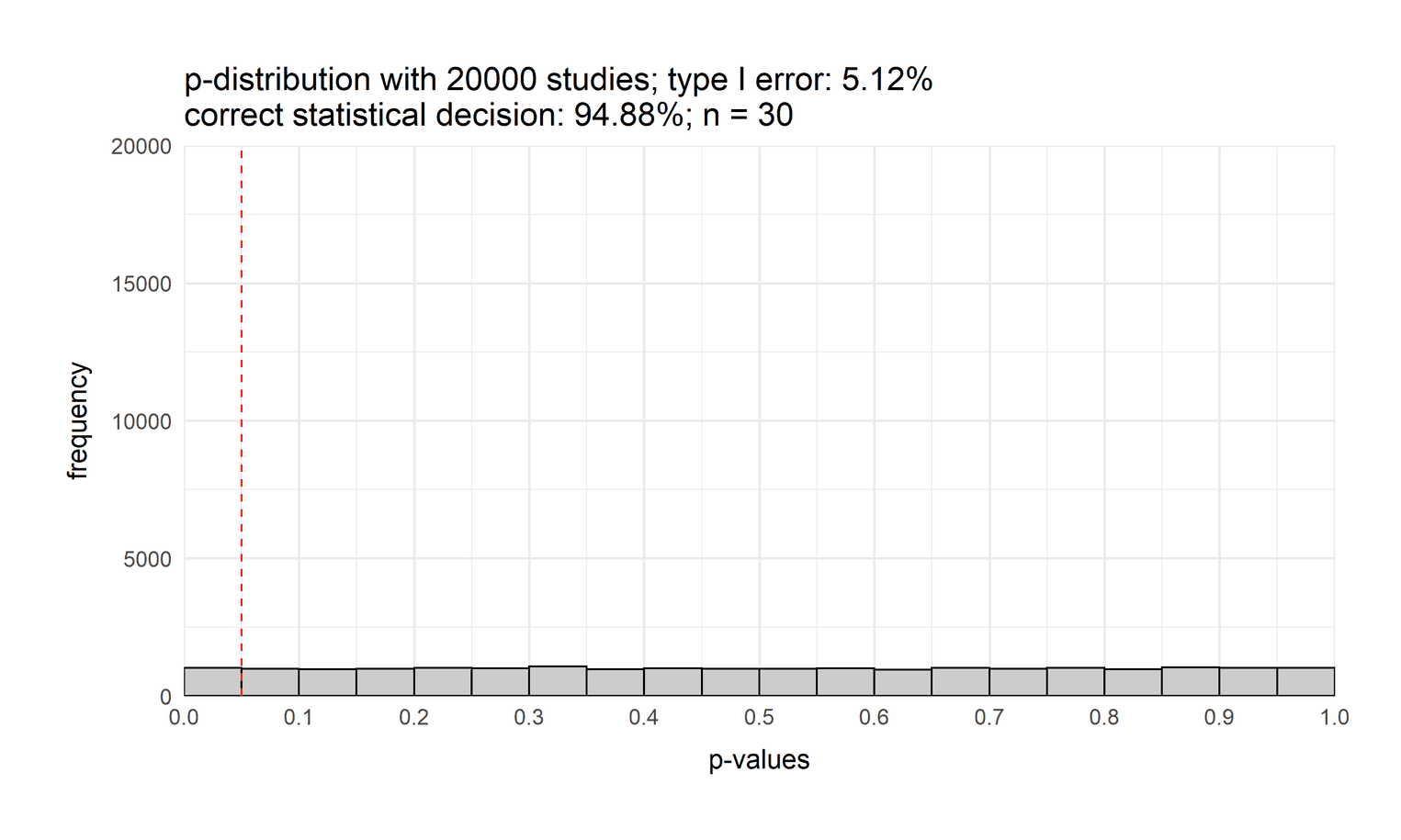
But what does this visualization show us? This visualization depicts the distribution of p-values when both groups have the same intelligence score. As you can see, the distribution is flat. If the null hypothesis is true, each p-value is equally likely. One might think that the p-distribution is normally distributed, but it is not. You can also see that we have a type I error rate of 5%: The probability that we will opt for the alternative hypothesis even though the null hypothesis is true.
Now that we know how to do these visualizations, let's create a function that combines all of the previous steps and returns a p-distribution. This will give us more flexibility in plotting our p-distributions:
get_p_value <- function(M1, M2, n, sd) {
  M1_group <- rnorm(n = n, mean = M1, sd = sd)
  M2_group <- rnorm(n = n, mean = M2, sd = sd)

  t_test <- t.test(M1_group, M2_group, alternative = "greater")

  t_test$p.value
}


plot_p_value_distribution <- function(nSims, M1, M2, n, sd) {
  # Get p-values
  p_values <- c(1:nSims) %>%
    map_dbl(~ get_p_value(M1, M2,
                          n, sd))

  # Calculate power of all studies
  power <- (sum(p_values < 0.05) / nSims)

  # p-distribution
  ggplot(NULL, aes(x = p_values)) +
    geom_histogram(binwidth = .05, fill = "grey80",
                   color = "black", boundary = 0) +
    labs(
      title = paste0("p-distribution with ",
                     nSims, " studies; power: ", round(power * 100, 2), "%\n",
                     "type II error: ", round(100 - (power * 100), 2), "%",
                     "; n = ", n),
      x = "p-values",
      y = "frequency"
    ) +
    geom_vline(xintercept = .05, color = "red", linetype = "dashed") +
    scale_y_continuous(limits = c(0, nSims), expand = c(0, 0)) +
    scale_x_continuous(limits = c(0, 1), expand = c(0, 0),
                       breaks = seq(0, 1, by = 0.1)) +
    theme_minimal(base_size = 13) +
    theme(
      plot.margin = unit(rep(1.2, 4), "cm"),
      axis.title.x = element_text(margin = margin(t = 10)),
      axis.title.y = element_text(margin = margin(r = 10))
    )

}
Varying the sample size
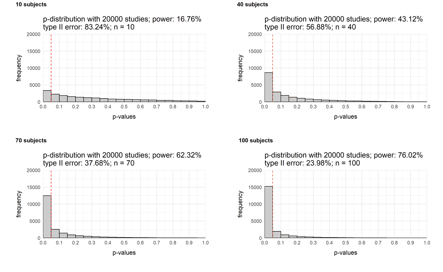
Now imagine there is an effect. Group 1 is slightly more intelligent than group 2 (IQ = 105 vs. IQ = 100). How likely will we get a significant result with different sample sizes? Now that we can easily generate p-distributions, we can combine multiple graphs and see how the p-distribution changes depending on the sample size. So let's create four distributions and then combine them with the plot_grid function of the cowplot package. Each simulation varies in the sample size of the experiment:
sample_10  <- plot_p_value_distribution(20000, 105, 100, 10, 15)
sample_40  <- plot_p_value_distribution(20000, 105, 100, 40, 15)
sample_70  <- plot_p_value_distribution(20000, 105, 100, 70, 15)
sample_100 <- plot_p_value_distribution(20000, 105, 100, 100, 15)

plot_grid(sample_10, sample_40,
          sample_70, sample_100,
          labels = c('10 subjects',
                     '40 subjects',
                     '70 subjects',
                     '100 subjects'),
          label_size = 12)
As you can see the power of a study increases as a function of sample size. While the chance of a significant result with a sample size of 10 people is only 17%, it increases to 76% with a sample size of one hundred people. In other words, if you assume a small effect of d = (105 - 100) / 15 = 0.33 (see this reference for more information), you would hardly find the effect with a small sample size.
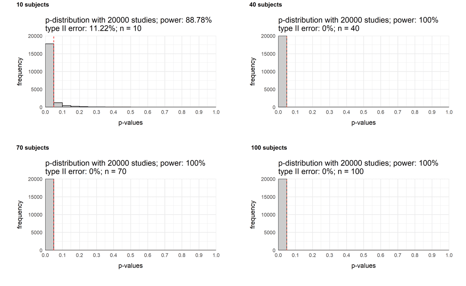
Let us assume that the effect is actually large, group 1 is much more intelligent than group 2: How does the power of our study change with different sample sizes?
sample_10  <- plot_p_value_distribution(20000, 120, 100, 10, 15)
sample_40  <- plot_p_value_distribution(20000, 120, 100, 40, 15)
sample_70  <- plot_p_value_distribution(20000, 120, 100, 70, 15)
sample_100 <- plot_p_value_distribution(20000, 120, 100, 100, 15)

plot_grid(sample_10, sample_40,
          sample_70, sample_100,
          labels = c('10 subjects',
                     '40 subjects',
                     '70 subjects',
                     '100 subjects'),
          label_size = 12)
Even a sample size of 40 would be sufficient to always find a significant result. Even with a sample size of 10 people, we will notice a difference with a chance of 89%. So if you try to find a large effect, a small sample size is enough to detect it.
Varying the size of the effect
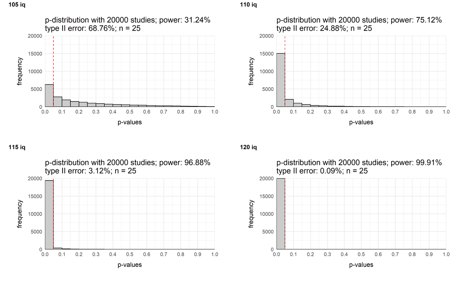
A similar mind exercise would be to change the size of the effect. You may already know that the power of a study increases with the size of the effect. Let's look at what it looks like in a typical study in the social sciences with a sample size of 25 people:
sample_10  <- plot_p_value_distribution(20000, 105, 100, 25, 15)
sample_40  <- plot_p_value_distribution(20000, 110, 100, 25, 15)
sample_70  <- plot_p_value_distribution(20000, 115, 100, 25, 15)
sample_100 <- plot_p_value_distribution(20000, 120, 100, 25, 15)

plot_grid(sample_10, sample_40,
          sample_70, sample_100,
          labels = c('105 iq',
                     '110 iq',
                     '115 iq',
                     '120 iq'),
          label_size = 12)
If our sample consists of 25 people, you need at least a medium effect to consistently find a difference.
Conclusion
The idea of this tutorial was to show you how to create p-value distributions yourself. For example, try to calculate p-value distributions for other statistical tests. You could also create a script and let your students solve specific tasks that will help them better understand the concepts of significance, power, and type I/II error.
