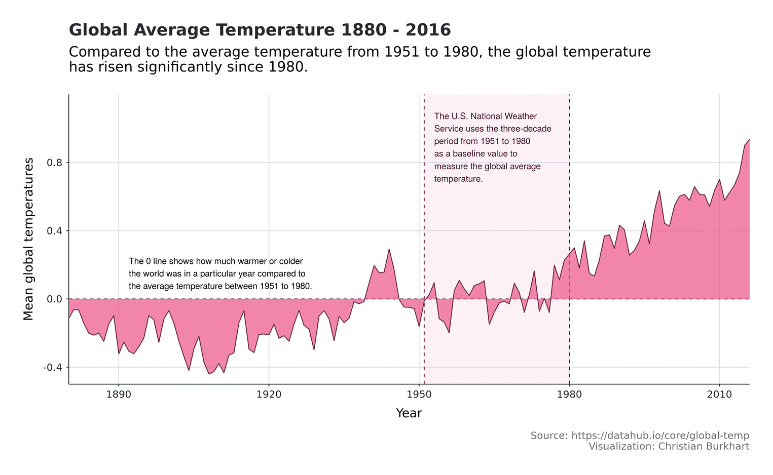
The question of whether the climate is being changed by man and what effects climate change will have on the world is a crucial issue for the coming decades. Ever since Greta Thunberg travelled to the states by sailing boat, we have been reminded of the problem even more.
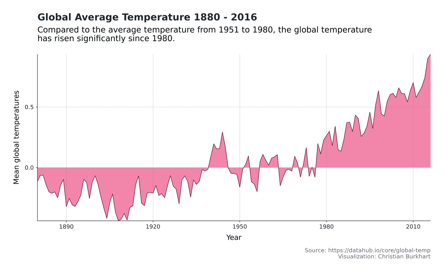
The data we have speaks for itself. The global temperature has risen significantly since 1980. In this article we try to illustrate this fact with a time series visualization. For this purpose we use a dataset of the Global component of Climate at a Glance (GCAG), which has recorded the worldwide temperatures since 1880.
The data for the time series can be found on this website. Download the csv file, which contains the annual temperature.
Inspecting the data
I saved the data under the name annual_csv. First, we read it with the function read_csv and have a look at it with the function glimpse:
temperatures <- read_csv("annual_csv.csv")
glimpse(temperatures, width = 40)
Observations: 274
Variables: 3
$ Source <chr> "GCAG", "GISTEMP", "GC…
$ Year <int> 2016, 2016, 2015, 2015…
$ Mean <dbl> 0.9363, 0.9900, 0.8998…The data comprise three variables. The annual temperature seems to have been measured independently by three different institutes. In this visualization we will use the data of the GCAG institute. For this we have to filter all rows containing data from this institute:
temperatures <- temperatures %>%
  filter(Source == "GCAG")
Create the time series
First we create a simple area chart with ggplot. For this we use the function geom_ribbon. geom_ribbon is especially useful for area charts that contain negative values. To highlight the area, we use a strong pink, which I borrowed from tailwind css.
ggplot(temperatures, aes(x = Year, y = Mean)) +
  geom_ribbon(aes(ymax = Mean, ymin = 0),
              fill = "#EB5286", alpha = 0.7) +
geom_line(color = "#6F213F") 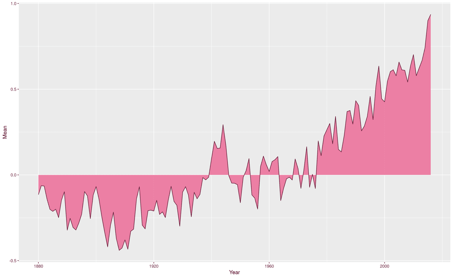
Add title, caption and axis labels
As always, we need an expressive title, a subtitle, axis labels and a caption that contains important additional information for each visualization. This information can be added to ggplot with the function labs:
ggplot(temperatures, aes(x = Year, y = Mean)) +
  geom_ribbon(aes(ymax = Mean, ymin = 0),
              fill = "#EB5286", alpha = 0.7) +
  geom_line(color = "#6F213F") +
  scale_y_continuous(expand = expand_scale(mult = 0)) +  scale_x_continuous(expand = expand_scale(mult = 0)) +  labs(    title = "Global Average Temperature 1880 - 2016",    subtitle = paste0("Compared to the average temperature ",                      "from 1951 to 1980, the global temperature\n",                       "has risen significantly since 1980."),    y = "Mean global temperatures",    caption = paste0("Source: https://datahub.io/core/global-temp\n",                     "Visualization: Christian Burkhart")  )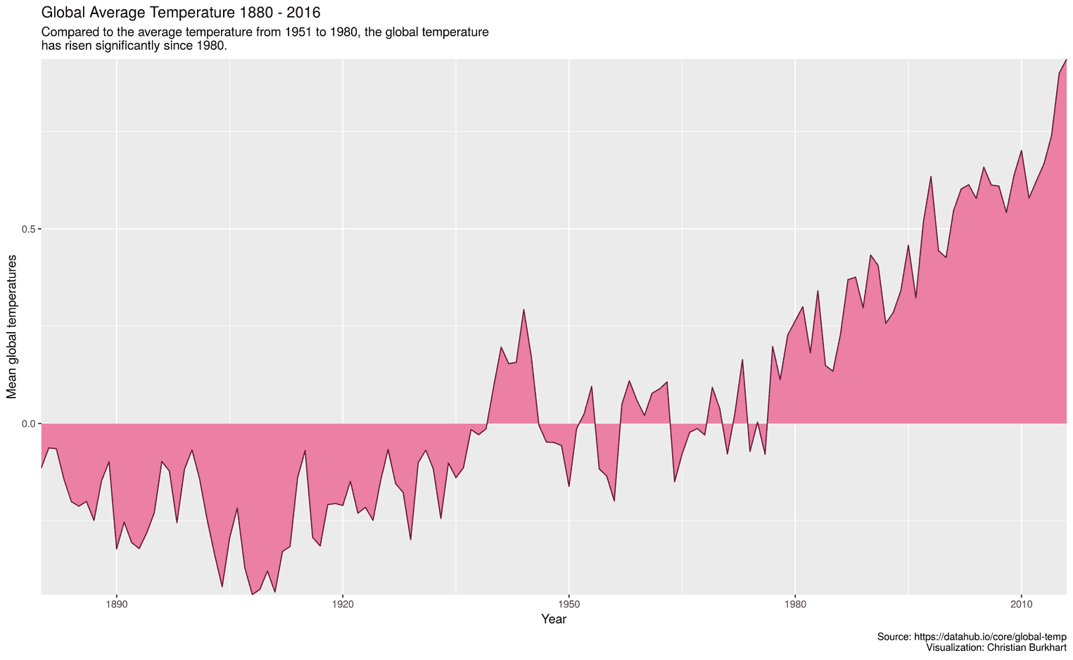
To avoid writing the strings too long, I used the function paste0. paste0 allows you to connect multiple strings without separators. This is often very convenient because lines should not be longer than 80 characters.
Additionally I removed the padding right and left as well as top and bottom from the time series with the help of the function expand_scale. I find it more aesthetically pleasing if the time series starts directly at the x-axis. If you disagree, you can simply remove these two lines.
Make it look good
Default values of visualization tools are rarely particularly readable. For example, our axis labels and the title are too small so far. In addition, the titles of the axes are often made too small, which in turn impairs the readability of the visualization. With the help of the function theme we can improve the size of the text:
ggplot(temperatures, aes(x = Year, y = Mean)) +
  geom_ribbon(aes(ymax = Mean, ymin = 0),
              fill = "#EB5286", alpha = 0.7) +
  geom_line(color = "#6F213F") +
  scale_y_continuous(expand = expand_scale(mult = 0)) +
  scale_x_continuous(expand = expand_scale(mult = 0)) +
  labs(
    title = "Global Average Temperature 1880 - 2016",
    subtitle = paste0("Compared to the average temperature ",
                      "from 1951 to 1980, the global temperature\n",
                      "has risen significantly since 1980."),
    y = "Mean global temperatures",
    caption = paste0("Source: https://datahub.io/core/global-temp\n",
                     "Visualization: Christian Burkhart")
  ) +
  theme(    text = element_text(family = "Roboto"),    plot.margin = unit(rep(1, 4), "cm"),    plot.title = element_text(size = 20,                               face = "bold",                              margin = margin(b = 10)),    plot.subtitle = element_text(size = 17,                                  margin = margin(b = 25)),    plot.caption = element_text(size = 12,                                margin = margin(t = 15)),    panel.grid.major = element_line(color = "#DAE1E7"),    panel.background = element_blank(),    axis.text = element_text(size = 12),    axis.text.x = element_text(margin = margin(t = 5)),    axis.text.y = element_text(margin = margin(r = 5)),    axis.title = element_text (size = 15),    axis.line = element_line(),    axis.title.y = element_text(margin = margin(r = 10),                                hjust = 0.5),    axis.title.x = element_text(margin = margin(t = 10),                                hjust = 0.5)  )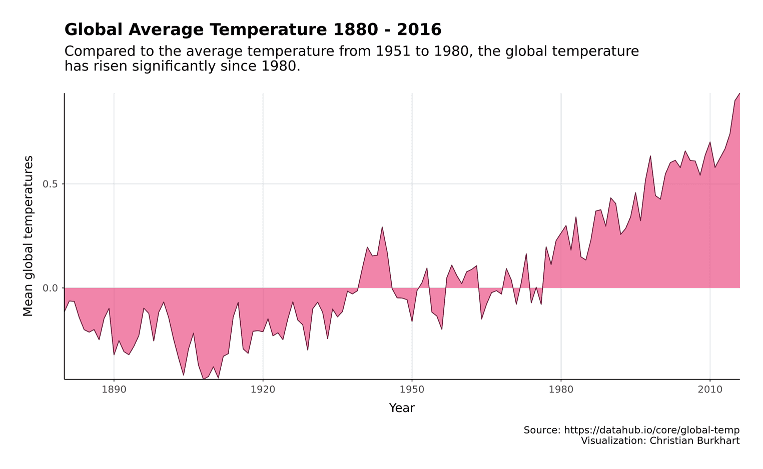
Globally we have now adapted the font of the visualization with the attribute text (see Roboto). Additionally we added a margin around the whole plot (see plot.margin). I also decided to darken the lines of the axes. Often visualizations do not include axis colors. However, I find them useful for time series, as they add a visual anchor that increases readability.
Adjust the colors
Before we add the annotations, we can adjust the colors a little bit. These changes are barely noticeable at first glance, but subtly change the perception of the visualization. First we make the caption grey so that it doesn't come to the fore. In addition, we don't make the title completely black, but add a little grey. We make the axis labels a little darker so that they are easier to read. We also add a little gray to the axis lines. The colors I borrowed again from tailwind css
ggplot(temperatures, aes(x = Year, y = Mean)) +
  # Previous time series code goes here
  theme(
    text = element_text(family = "Roboto"),
    plot.margin = unit(rep(1, 4), "cm"),
    plot.title = element_text(size = 20,
                              color = "#22292F",                              face = "bold",
                              margin = margin(b = 10)),
    plot.subtitle = element_text(size = 17,
                                 margin = margin(b = 25)),
    plot.caption = element_text(size = 12,
                                margin = margin(t = 15),
                                color = "#606F7B"),
    panel.grid.major = element_line(color = "#DAE1E7"),    panel.background = element_blank(),
    axis.text = element_text(size = 12, color = "#22292F"),    axis.text.x = element_text(margin = margin(t = 5)),
    axis.text.y = element_text(margin = margin(r = 5)),
    axis.title = element_text (size = 15),
    axis.line = element_line(color = "#3D4852"),    axis.title.y = element_text(margin = margin(r = 10),
                                hjust = 0.5),
    axis.title.x = element_text(margin = margin(t = 10),
                                hjust = 0.5)
  )
Add annotations
Finally, we would like to try to add some important information to the visualization. A special feature of the global temperature measurement is that it is rarely given by absolute temperatures, but by a baseline that is defined over several decades. In this case, the annual temperature of the years 1951 to 1980 was averaged and determined as a reference value. For example, a value of 1 on the y-axis means that the temperature is 1 degree warmer in a given year compared to the reference years 1951 to 1980.
To explain this to readers, we add a rectangular area that indicates and explains the reference period. We also add an annotation that explains what the 0 line stands for:
ggplot(temperatures, aes(x = Year, y = Mean)) +
  annotate("segment", x = 1880, xend = 2016,           y = 0, yend = 0,           linetype = "dashed",           color = "#6F213F") +  annotate("segment", x = 1951, xend = 1951,           y = -0.5, yend = 1.2,           linetype = "dashed",           color = "#451225") +  annotate("segment", x = 1980, xend = 1980,           y = -0.5, yend = 1.2,           linetype = "dashed",           color = "#451225") +  annotate("rect",           fill = "#FA7EA8", alpha = .1,            xmin = 1951, xmax = 1980,            ymin = -0.5, ymax = 1.2) +  annotate("text", x = 1953, y = 0.89,           hjust = 0, color = "#451225",           size = 3.7,           label = paste0("The U.S. National Weather\nService ",                          "uses the three-decade\nperiod from 1951 to 1980\n",                          "as a baseline value to\nmeasure the global ",                          "average\ntemperature.")) +  annotate("text", x = 1892, y = 0.15,           hjust = 0, size = 3.7,           label = paste0("The 0 line shows how much warmer or colder\n",                          "the world was in a particular year ",                          "compared to\nthe average temperature between ",                          "1951 to 1980.")) +  geom_ribbon(aes(ymax = Mean, ymin = 0),
              fill = "#EB5286", alpha = 0.7) +
  # Rest of time series goes here
For a more detailed understanding of how annotations work, see the documentation. However, the procedure is always the same. An annotation is a single element that has no connection to the data. For example, a text that we want to add at a certain point in the visualization. Often I play around with the x and y values until I get a satisfactory result. The hjust attribute is also helpful for texts. With the help of hjust you can determine whether a text is centered, left-centered or right-centered. For example, the value 0.5 stands for a centered text, the value 0 for a left centered text and the value 1 for a right centered text. We add our area between 1951 and 1980 using a rectangle and two lines.
To finally save the visualization you can use the function ggsave:
ggsave(width = 13, height = 8, "temperatures.png")That's it. I hope you enjoyed the tutorial.
