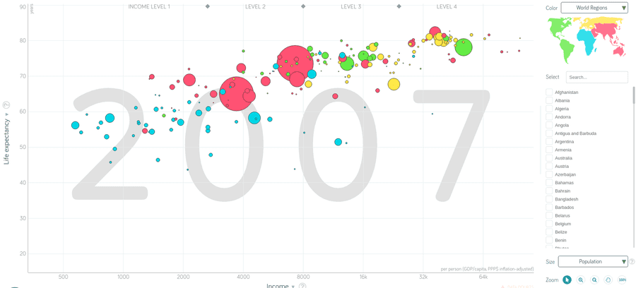
In this tutorial you will learn how to reproduce one of the most famous data visualizations of the world, which was developed by Hans Rosling:
Hans Rosling was a professor for International Health and a spokesperson for human progress. For example, contrarily to common belief global world poverty has declined tremendously in the past decades. The visualization you can see above is one of many examples that show how life on earth as improved in the past decades. The scatterplot depicts the relationship between per capita income and life expectancy in 2007.
The goal of this tutorial is to replicate this famous data visualization and use some more complex techniques in ggplot2 to add a visualization within a visualization.
Getting the data
First, we need the gapminder data. Luckily, there is a gapminder package in R for that. As usual, we first need to load all the necessary packages for the visualization:
library(tidyverse)
library(gapminder)
library(ggthemes)
library(countrycode)
Let's look at the dataset:
glimpse(gapminder, width = 50)Observations: 1,704
Variables: 6
$ country <fct> Afghanistan, Afghanistan, A...
$ continent <fct> Asia, Asia, Asia, Asia, Asi...
$ year <int> 1952, 1957, 1962, 1967, 197...
$ lifeExp <dbl> 28.801, 30.332, 31.997, 34....
$ pop <int> 8425333, 9240934, 10267083,...
$ gdpPercap <dbl> 779.4453, 820.8530, 853.100...Before we can start visualizing the data, we need to do some data cleaning.
First, we are only interested in the datapoints of the year 2007 and need to filter them. To do that we use the filter function of dplyr. The visualization does not differ between the continent Oceania and Asia, however the gapminder dataset does make a difference. Hence, we need to subsume Oceania under Asia. To do that, we will use the function case_when, which allows us to create new variables on specific conditions. Since the default colors of the continents will not match the gapminder colors, we need to define the levels of the factor continent so that we can apply the right colors to the right continents. We will later arrange the colors in the following order: # red: #F15772; # green: #7EEB03; # yellow: #FBE700; # blue: #54D5E9.
gapminder_cleaned <- gapminder %>%
filter(year == "2007") %>%
mutate(
  pop2 = pop + 1,
  continent = case_when(
    continent == "Oceania" ~ "Asia",
    TRUE ~ as.character(continent)
  ) %>% as.factor %>%
    fct_relevel("Asia", "Americas", "Europe", "Africa")
)
Creating the first scatterplot
After cleaning the data, we are ready to create a first scatterplot. The first visualization will be one of many. First, we will try to replicate the gapminder scatterplot as close as we can. Second, we will create a world map that visualizes the world continents in the same colors as the points in the scatterplot. Third, we will need to combine both visualizations to one visualization and add a title and subtitle to the visualization.
Let's create the first scatterplot:
ggplot(data = gapminder_cleaned, aes(x = gdpPercap, y = lifeExp)) +
  geom_point(aes(size = pop, color = continent)) +
  geom_point(aes(size = pop2), color = "black", shape = 21) +
  scale_x_log10(breaks = c(500, 1000, 2000, 4000,
                           8000, 16000, 32000, 64000)) +
  scale_y_continuous(breaks = seq(0, 90, by = 10)) +
  scale_color_manual(values = c("#F15772", "#7EEB03",
"#FBE700", "#54D5E9")) 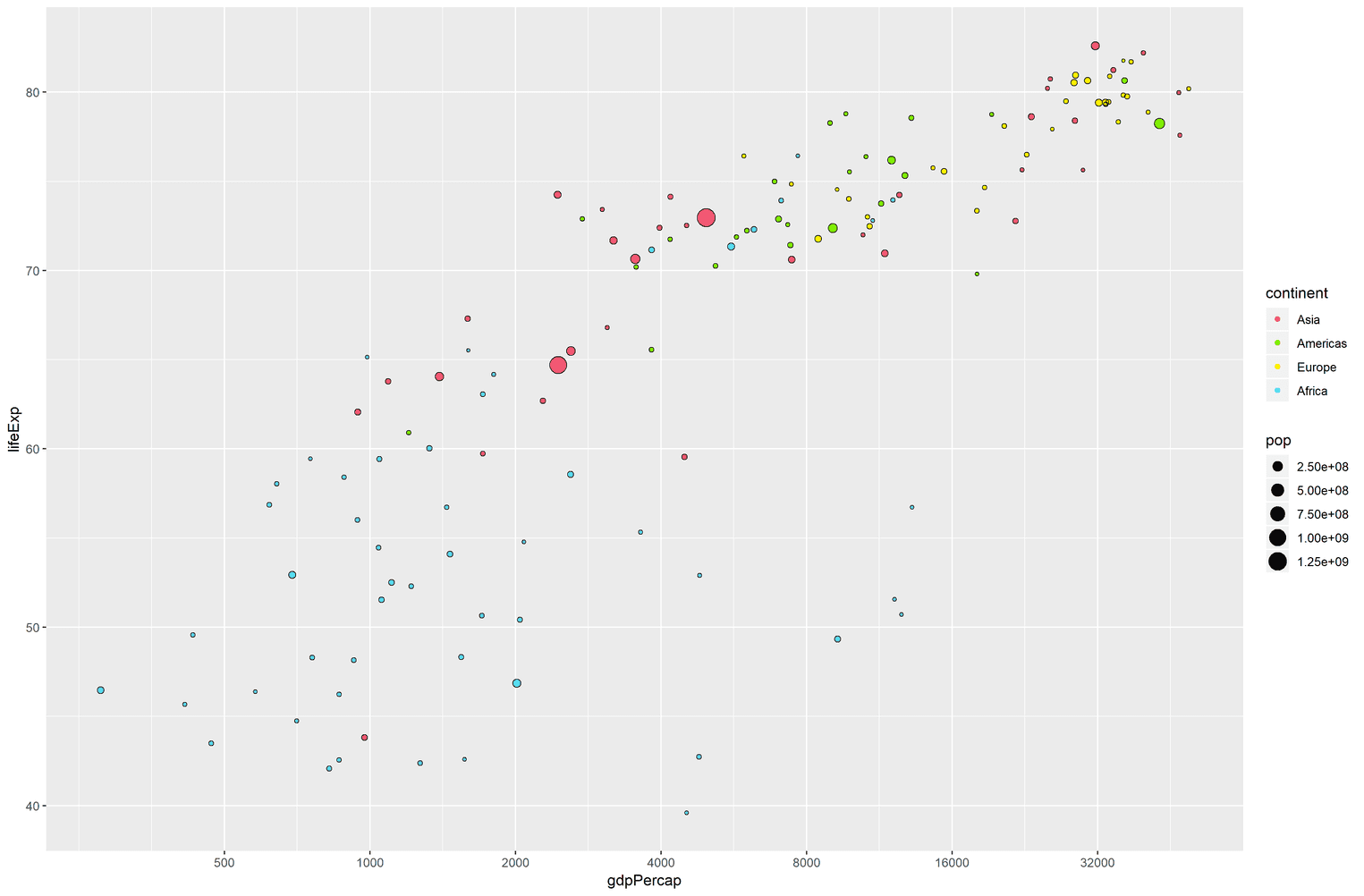
A couple of things are happening here. You might wonder why we added two geom_point to the visualization? The points in the gapminder visualization have a black border. To my knowledge it is not easily possible to add these to geom_points. Hence, we will create a second geom_point with an empty fill by using the shape = 21. The variable pop2 is just a little bit bigger than the variable pop so that we emulate a border by adding a point above another point.
We also change the scale of the x-axis to a logarithmic scale. It turns out that income is widely distributed among the countries. By using a logarithmic scale we can adjust for these differences. Additionally, the y-axis of the gapminder scatterplot has breaks on every tenth value (50, 60, ...). We do the same by using the scale_y_continuous function. Lastly, we adjust the fill colors to the order we assigned when we cleaned the data.
Adjusting the scatterplot
The scatterplot is far from perfect yet. The size of the points is not big enough. The background of the visualization is grey instead of white and we need to get rid of the legend:
ggplot(data = gapminder_cleaned, aes(x = gdpPercap, y = lifeExp)) +
  geom_point(aes(size = pop, color = continent)) +
  geom_point(aes(size = pop2), color = "black", shape = 21) +
  scale_x_log10(breaks = c(500, 1000, 2000, 4000,
                           8000, 16000, 32000, 64000)) +
  scale_y_continuous(breaks = seq(0, 90, by = 10)) +
  scale_color_manual(values = c("#F15772", "#7EEB03",
                                "#FBE700", "#54D5E9"))  +
  scale_size_continuous(range = c(1, 30)) +  guides(size = FALSE, color = FALSE) +  labs(    x = "Income",    y = "Life expectancy"  ) +  theme_minimal()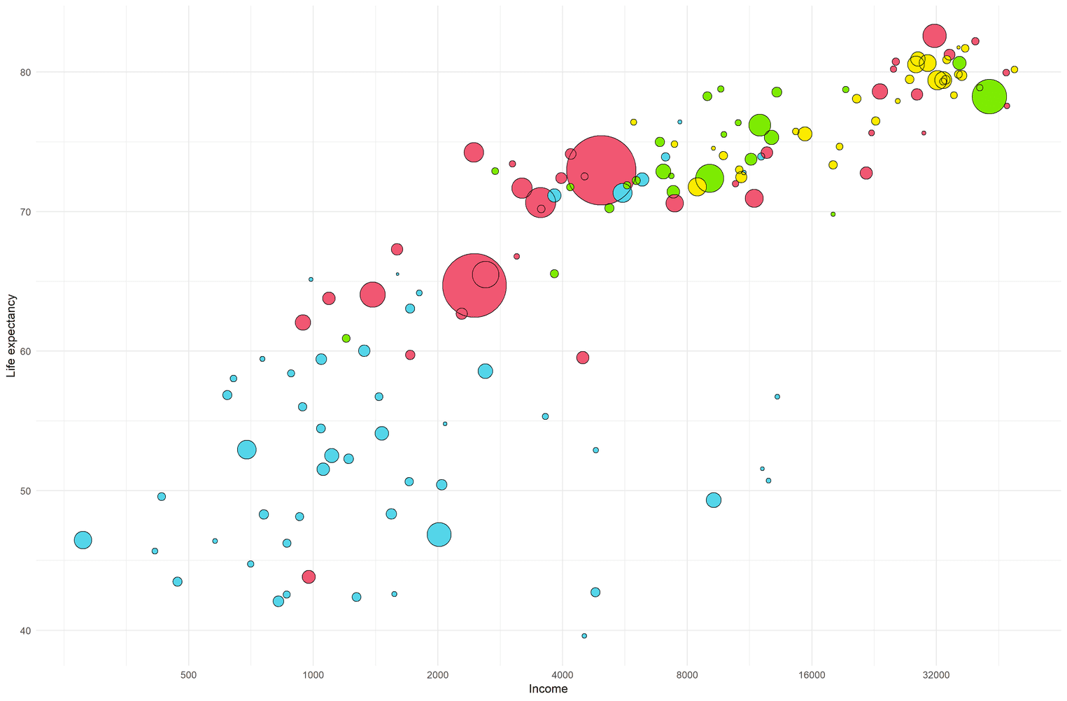
To get rid of the legend, we use the guides function and assign the size of the points and the color of the points to FALSE. To enlarge the size of the points, we use the scale_size_continuous function. I fiddled a little bit with the values until the points were about the same size as the original visualization. Lastly, I added the x and y labels and used theme_minimal to get rid of the grey background.
Style axes and grid of visualization
Before we can start to design the worldmap, we need to adjust the axes and the the grid of the visualization to fit it to the original visualization. The original visualization has grey axis lines and less grid lines than our current visualization. However, we will deviate from the original visualization a little bit. If you look at the screenshot again you can see that the x-axis start at a life-expectancy of 50. Usually it is not a good idea to crop an axis, hence we will visualize the axis from 0 to 90. To get rid of the grid lines we will set the minor grid lines to FALSE. In addition, we will adjust the size and color of the axes and grid lines and change the font family of the axis labels.
ggplot(data = gapminder_cleaned, aes(x = gdpPercap, y = lifeExp)) +
  # Insert previous visualization here
  theme(    plot.margin = unit(rep(1, 4), "cm"),    panel.grid.minor = element_blank(),    panel.grid.major = element_line(size = 0.2,                                     color = "#e5e5e5"),    axis.title.y = element_text(margin = margin(r = 15),                                 size = 11,                                family = "Helvetica Neue Light"),    axis.title.x = element_text(margin = margin(t = 15),                                 size = 11,                                family = "Helvetica Neue Light"),    axis.text = element_text(family = "Helvetica Neue Light"),    axis.line = element_line(color = "#999999",                              size = 0.2)  ) +  coord_cartesian(ylim = c(4.1, 86))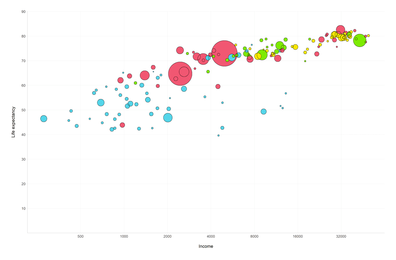
You might wonder what the coord_cartesian function is doing at the end? With the function you can specifically tell the limits of the y or x axis. Technically you could to the same with the scale_y_continuous function using the limits attribute, however, scale_y_continuous removes all data points from the visualization that are cut by the axis lines. coord_cartesian works like a lense and does not remove these points. In addition, I set the lower limit of the y-axis to 4.1 so that the major grid line of the null point on the y-axis is hidden. This is apparently not the most elegant way to do it, but it works.
Improve the readability of the visualization
If you compare our visualization to the original we miss one important step: The big 2007 text in the middle of the visualization. In addition, I want to help the readers understand the meaning of the points immediately. Hence, we will add an annotation that explains what the blue dot for the country Nigeria means:
(gapminder_plot <- ggplot(data = gapminder_cleaned, aes(x = gdpPercap, y = lifeExp)) +  annotate("text", x = 4000, y = 45, hjust = 0.5,           size = 85, color = "#999999",           label = "2007", alpha = .3,           family = "Helvetica Neue") +  # Add previous plot here
  annotate("segment", x = 0, xend = 2014, y = 46.9, yend = 46.9,            color = "#606F7B", linetype = 2, size = .2) +  annotate("segment", x = 2014, xend = 2014, y = 0, yend = 46.9,           color = "#606F7B", linetype = 2, size = .2) +  annotate("text", x = 28200, y = 2,            label = "per person (GDP/capita, PPP$ inflation-adjusted)",           size = 2.8, color = "#999999") +  annotate("text", x = 2304, y = 42, hjust = 0,           size = 3.5,           label = paste0("Nigeria had a life expectancy of\n",                          "46.9 years and an annual income of",                          "\n$2014 per year per person in 2007")) +  theme(
    plot.margin = unit(rep(1, 4), "cm"),    panel.grid.minor = element_blank(),
    panel.grid.major = element_line(size = 0.2,
                                    color = "#e5e5e5"),
    axis.title.y = element_text(margin = margin(r = 15),
                                size = 11,
                                family = "Helvetica Neue Light"),
    axis.title.x = element_text(margin = margin(t = 15),
                                size = 11,
                                family = "Helvetica Neue Light"),
    axis.text = element_text(family = "Helvetica Neue Light"),
    axis.line = element_line(color = "#999999",
                             size = 0.2)
  ) +
  coord_cartesian(ylim = c(4.1, 86)))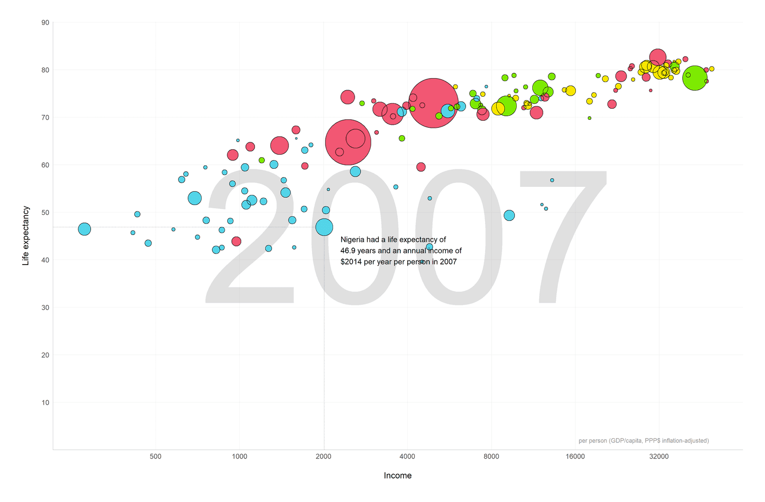
Whenever you want to add a single text segment or a line to a visualization you add an annotation. First, we add one annotation to add the big 2007 text to the background of the visualization. Second, we add an annotation to describe how to read the plot at the example of Nigeria. In order to find the most appropriate x and y values you can filter Nigeria from the dataset and adjust the values accordingly. I also added two dashed lines to make the annotation more readable. Lastly, I added some margin around the whole visualization to make the visualization look less dense.
Mind that I also stored the visualization in the variable gapminder_plot.
Get the data for the world map
Now that we have finished the scatterplot we will create the visualization of the continents. Our goal is to create a world map in which the colors of the continents match the colors of the points in the scatterplot.
There are different ways to create a visualization in ggplot2. We will use a technique, which uses the geom_map geom. geom_map takes a map argument, which is a dataframe that specifies the longitude and latitude of different regions of the world.
In order to do that, we take the map_data function, which allows use to create a dataframe with the longitude and latitude of every country of the world. Since no one lives in Antarctica, we will filter Antarctica from the dataframe. The major problem we need to solve is how to add the name of the continent to the dataframe. There is no continent variable in the dataframe provided by map_data("world"). However, the package countrycode has a function countrycode, which enables us to extract the continent from each country name.
countrycode differentiates between Oceania and Asia. If you look at the original gapminder visualization you will see that they do not make this difference. Hence, we will also subsume Oceania under Asia using the case_when function. Lastly, we need to relevel the factor continent to match it to the order of the colors we will assign to the continents in the next step.
world <- map_data("world") %>%
  filter(region != "Antarctica") %>%
  mutate(
    continent = countrycode(sourcevar = region,
                            origin = "country.name",
                            destination = "continent"),
    continent = case_when(
      continent == "Oceania" ~ "Asia",
      TRUE ~ as.character(continent)
    ) %>% as.factor %>%
      fct_relevel("Asia", "Americas", "Europe", "Africa")
  ) %>%
  drop_na(continent)

glimpse(world, width = 50)
Observations: 93,989
Variables: 7
$ long <dbl> -69.89912, -69.89571, -69.9...
$ lat <dbl> 12.45200, 12.42300, 12.4385...
$ group <dbl> 1, 1, 1, 1, 1, 1, 1, 1, 1, ...
$ order <int> 1, 2, 3, 4, 5, 6, 7, 8, 9, ...
$ region <chr> "Aruba", "Aruba", "Aruba", ...
$ subregion <chr> NA, NA, NA, NA, NA, NA, NA,...
$ continent <fct> Americas, Americas, America...Create a first world map with the world continents
Let's create the map:
ggplot(data = world) +
  geom_map(map = world,
           aes(long, lat, group = group, map_id = region,
               fill = continent)) +
  theme_map() +
  coord_map(xlim = c(-180, 180),
            ylim = c(-200, 200))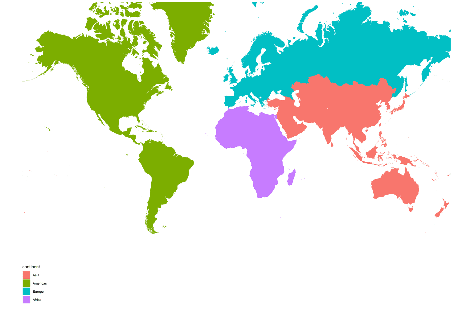
The function theme_map removes all grid lines, backgrounds and axes from the visualization. We also need the coord_map function to adjust the size of the continents. Otherwise the continents would look distorted.
Improving the continent map
Before we can add this visualization to our scatterplot, we need some adjustments. First, we need to store the visualization in a variable called continent_map. Second, we need to change the default fill colors of the continents and match them to the same colors of the scatterplot points. Third, we don't need the legend of the map. Most people know where Europe or Asia is. Lastly, we want to add a border around the visualization:
(continent_map <- ggplot(data = world) +   geom_map(map = world,
           aes(long, lat, group = group, map_id = region,
               fill = continent)) +
  theme_map() +
  coord_map(xlim = c(-180, 180),
            ylim = c(-200, 200)) +
  scale_fill_manual(values = c("#F15772", "#7EEB03",                               "#FBE700", "#54D5E9")) +  guides(fill = FALSE) +  theme(    plot.background = element_rect(color = "#B8C2CC", fill = NA)  ))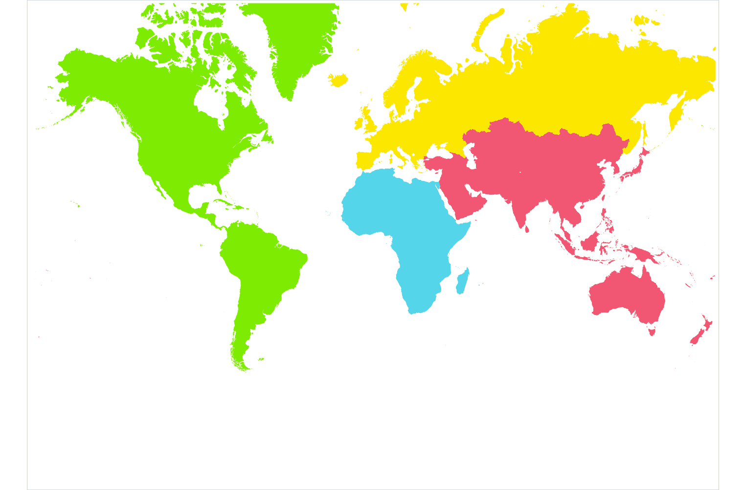
Adding the continent map to the scatterplot
To add the continent map to the scatterplot we use the annotation_custom function. We need to wrap the continent map around the ggplotGrob function otherwise annotation_custom will throw an error. We then need to add the xmin, xmax, ymin, and ymax values to indicate where in our visualization the continent visualization should be placed. Since we used a logarithmic scale in our scatterplot I used the log10 function to convert the x values to a logarithmic scale. You can probably see that the numbers on the x axis do not really add up. To be honest, that was a problem I couldn't solve myself. Hence, I played around with the values until it look ok for me.
gapminder_plot +
  annotation_custom(grob = ggplotGrob(continent_map),
                    xmin = log10(800),
                    xmax = log10(650000),
                    ymin = 5,
                    ymax = 42)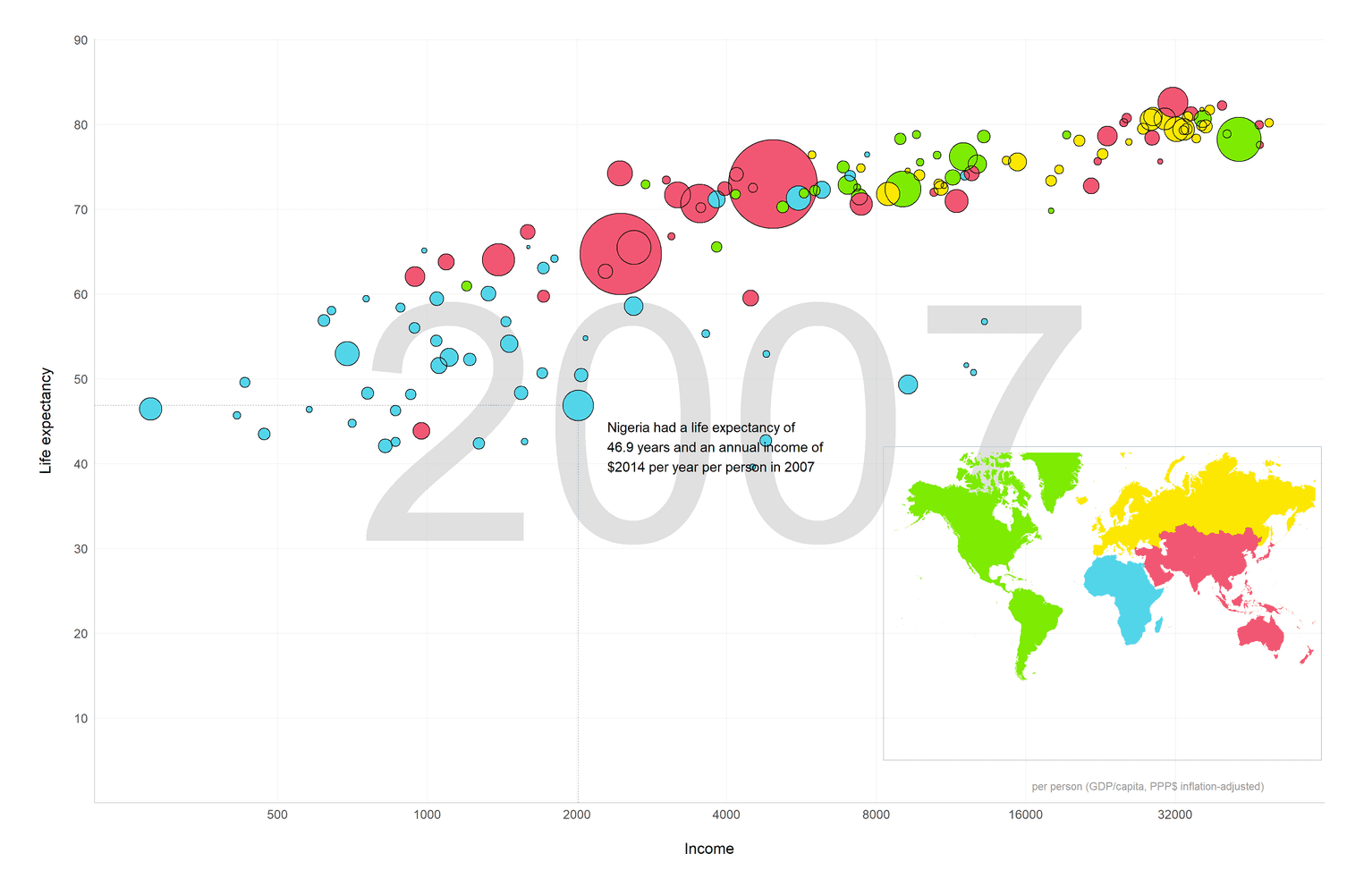
Adding a title and a subtitle to the final plot
At last, we can add the title and subtitle to the visualization:
gapminder_plot +
  annotation_custom(grob = ggplotGrob(continent_map),
                    xmin = log10(800),
                    xmax = log10(650000),
                    ymin = 5,
                    ymax = 42) +
  labs(    title = "Life Expectancy and Income in 2007",    subtitle = paste0("In the following visualization you can see the ",                      "relationship between income and life expectancy\n",                      "among all countries in 2007. African countries are ",                      "still lagging behind in terms of general\nlife expectancy. ",                      "The European and American countries are the healthiest ",                      "and richest countries\nin the world.")  ) +   theme(    plot.margin = unit(rep(1, 4), "cm"),    plot.title = element_text(color = "#22292F", hjust = 0,                              margin = margin(b = 15),                              size = 30,                              face = "bold",                              family = "Titillium Web"),    plot.subtitle = element_text(color = "#3D4852", hjust = 0,                                 margin = margin(b = 35),                                 size = 17,                                 lineheight = 1.1,                                 family = "Titillium Web")  )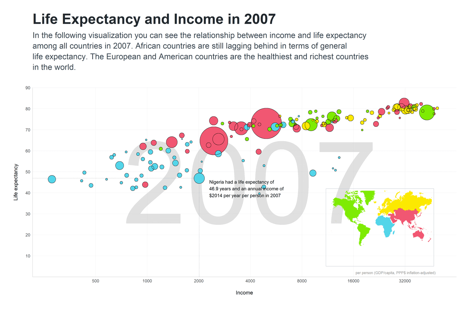
Apart from adding the title and subtitle, I styled them as well. First, I made the title and subtitle considerably bigger than the default values. Since the background of the visualization is white I reduced the contrast of the title and subtitle and used slightly lighter black colors. In order to add some space, I additionally added some margin to the overall plot and below the subtitle.
That's it. I hope you could get along. Hope you enjoyed it.

