As a data enthusiast, exploring information and presenting it with clarity and visual appeal can be a great advantage. ggplot2 is a powerful R package that allows you to create a wide range of plots. It helps you visualize data insights dynamically. In line graphs, distinct line types and styles enhance understanding through differentiation and aesthetic appeal. This post delves into creating data, using ggplot2 to plot lines, and changing line styles to improve data visualization. From altering line attributes globally to customizing them manually or automating changes by groups, ggplot2 offers numerous features. Additionally, we offer some recommendations to expand your knowledge. Enjoy exploring the world of line types and styles in ggplot2!
Create some data
GGplot2 works efficiently when supplied with structured data. To start, we will create a simple dataset using R. Suppose we’re tracking monthly sales figures of a hypothetical company across different regions. We’ll use a basic data frame to encapsulate this information, featuring columns like ‘Month’, ‘Region’, and ‘Sales’. This foundational dataset will guide our visual explorations.
Creating the data structure might employ built-in functions such as ‘data.frame’. For instance, using sequences and predefined vectors, we can concoct a reasonable simulation of sales data. After erecting this scaffold, our data is ready for transformation into insightful visuals using ggplot2. The purpose of well-curated data is to enable seamless plotting and visualization, pivotal to extracting valuable insights.
Generate some data
Generating data goes hand-in-hand with creating it, yet it accents diverse scenario representations. Using R’s innovative capabilities like ‘replicate’ or random sampling functions like ‘rnorm’, you can fabricate diverse metrics. For example, by producing synthetic datasets, model new product sales under varying market conditions, reflecting potential fluctuations and trends.
This pseudo-random data generation offers myriad advantages beyond textual comprehension: fostering experimental analysis, hypothesis testing, and forecasting models, fortifying data-centric decision-making. Deciphering these dynamic data evolutions graphically, ggplot2 analogizes swiftly complex data renditions into bright reader-friendly depictions.
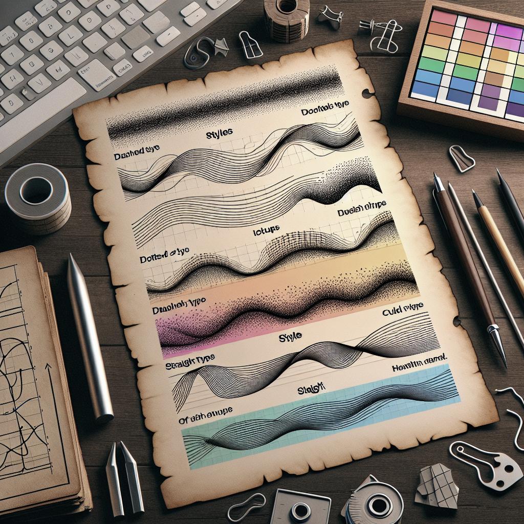
Create line plots and change line types
Having established a robust dataset, creating line plots in ggplot2 begins with the ‘ggplot()’ function, coupled with ‘geom_line()’ for line plotting. Line plots offer nuanced views of data trends over continuous variables. Our sales data visualization could unfold over time, with separate lines for each region.
Modifying line types enhances plot clarity. For instance, line type modifications clarify overlapping timelines or signify distinguished regions. Characteristics like solid (default), dotted, and dashed lines help in visibly demarcating differentiated data paths, serving analytical efficacy and style.
Change globally the appearance of lines
In some analyses, altering the global appearance of lines ensures uniformity, streamlining multifaceted data visualizations channeling towards analogous inferences. The ‘theme()’ function or setting global aesthetics like ‘lty’ (line type) within ggplot2 enhances collective presentations.
Managing overall aesthetics globally can be beneficial, especially when handling comprehensive datasets. Utilizing consistent line styles pertains not just to aesthetic unity but also to ease of plot adaptation, ensuring plot congruency across multiple outputs.
Change automatically the line types by groups
Automated adaptations to line types according to data groupings deliver succinct informational portrayals. Using ‘aes()’ within ggplot2, map line types conditionally upon a factor, such as ‘Region’. This precludes manual finagling while creating plots revealing regional or categorical divergences more dexterously.
Automatic line-type alterations furnish the luxury of extensive data group comparisons at a pragmatic glance. By permitting ggplot2’s automated functionalities, more energy can focus on discerning insights than on procedural plot adjustments.
Change manually the appearance of lines
Sometimes, precise manual tweaks to line appearances are indispensable for exquisite presentations. ggplot2 authorizes granular control over each line aspect, where custom line alterations craft precise stylings specific for research, publication, or presentation requisites.
By indulging ‘scale_linetype_manual()’, special line patterns were discerned explicitly, allotting definite style pointers to distinct data strands. Such granularity enhances presentation quality, personalizing plots to appeal distinctly to varied audit audiences.
Recommended for You!
To gain superiority in data visualization and coding fluency, diverse resources exist to broaden your skillset. Following are some enlightening sources and readings for aspiring data wizards ready to delve deeper.
Recommended for you
Books – Data Science
- “R for Data Science” by Hadley Wickham & Garrett Grolemund – An outstanding guide that broadens your R programming and visualization prowess.
- “Data Visualization: A Practical Introduction” by Kieran Healy – Offers an engaging introduction to modern data visualization techniques.
- “Visualize This” by Nathan Yau – A comprehensive resource illustrating data storytelling techniques and tools.
Summary of main points
| Topic | Details |
|---|---|
| Create some data | Build a structured, foundational dataset for visualization. |
| Generate some data | Use R functions to simulate diverse scenario datasets. |
| Create line plots and change line types | Use ggplot2 to showcase data trends and alter line styles for clarity. |
| Change globally the appearance of lines | Employ global changes for consistent and clear visual presentations. |
| Change automatically the line types by groups | Leverage automated group-specific line customization with ggplot2. |
| Change manually the appearance of lines | Utilize precise manual adjustments for tailored data depictions. |

