A complete training course that helps you create data visualizations in ggplot2

Taught by Christian Burkhart
A complete training course for ggplot2.
9 modules
11+ hours of videos
8 cheat sheets
3 web apps
Full source code
Unlimited updates
Learn ggplot2
In one place
ggplot2 has a great community of people who have created a huge amount of learning materials. Finding the "good stuff" and putting them into a coherent personal curriculum, however, is hard. What makes it even harder is that you won't find any materials for some of the most crucial concepts on the internet (e.g., aesthetics for geometric objects).
And there are many concepts to learn. You need to become familiar with data types, geometric objects, aesthetics, aesthetic mappings, faceting, scales, summary statistics, and themes.
This training course covers all these fundamental concepts of ggplot2 in one place! Once you have taken this course you will be able to create almost any data visualization in ggplot2 with ease. Here is what you'll get from the course:
Is this course for me?
The course is for anyone who wants to learn ggplot2 from the ground up and for those who look for a single course that covers all the fundamental concepts of ggplot2.
Students interested in creating visualizations for their theses
Data scientists interested in learning how to create visualizations in ggplot2 fast and effectively
Data journalists who want to create print-ready visualizations
Scientists who need to create data visualizations on a daily basis
You should ...
... be able to to run scripts in R and to set up a project in R-Studio.
... have some basic tidyverse skills. Basic skills are enough, you don't have to be a tidyverse superhero.
Still undecided if this course is for you? Don't worry, Udemy offers a 30-Day Money-Back Guarantee.
The
Curriculum
The curriculum covers all the fundamental concepts you need to create 90% of your visualizations.We will start with the most important concept, aesthetic mappings. We will then learn how to create the most basic plots. Once you are able to create these plots, we will discuss common pitfalls that beginners to ggplot2 often run into. In the next modules, we will learn how to customize aesthetic mappings with scales, how to create multiple plots by faceting, how to calculate summary statistics, and how to change the theme of your plots. Finally, we will give you some tips and tricks that everyone learning ggplot2 should know. Along the way, we will also create four best practice visualizations that cover all of the fundamental concepts we learn in this course.
Module 1
Introduction and Set-up
In this module, we will learn about the materials of this course. These include the R scripts of the repository, the cheat sheets, the web apps and the best practice visualizations.
Welcome1 min
Pre-requisites1 min
Getting the R-scripts, cheat sheets and best practice visualizations3 min
The World Bank dataset1 min
Best practice visualizations2 min
Module 2
Aesthetic Mappings
In this module we will talk about the fundamental concept in data visualization: aesthetic mappings. We will talk about aesthetics, data types as well as the mapping of both.
What is a data visualization?5 min
Aesthetics of geometric objects4 min
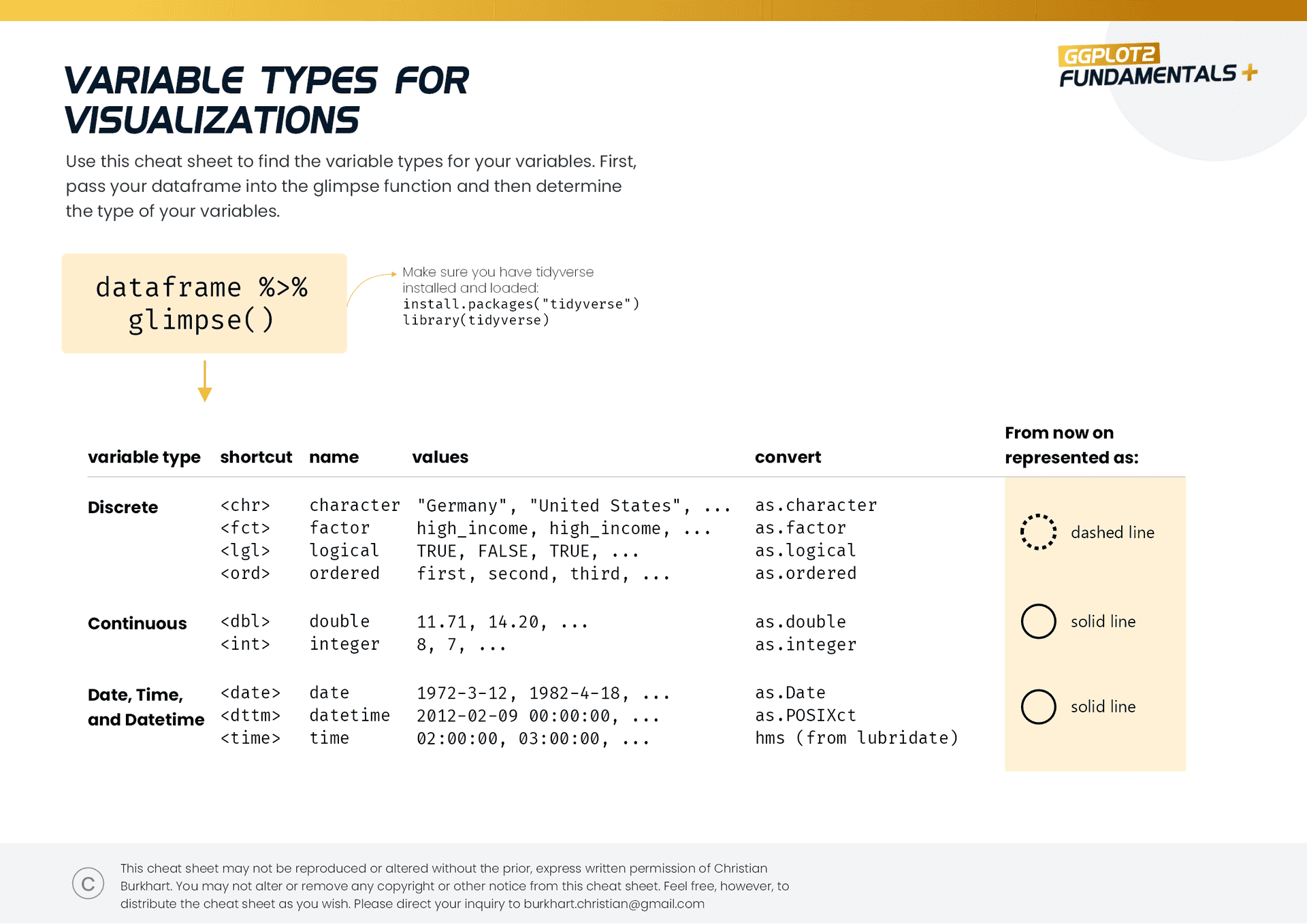
Data types4 min
Aesthetic mappings6 min
Mapping and setting aesthetics3 min
Exercise: From plots to aesthetic mappings9 min
Exercise: From asthetic mappings to plots4 min
Don't use the same aesthetic twice2 min
Exercise: Mapped and set aesthetics7 min
Exercise: Why is this plot hard to comprehend?3 min
Summary2 min
Module 3
Fundamental Visualizations
In this module we create the first visualizations in ggplot2 using the cheat sheets and start the best practice visualizations.
Introduction1 min
The ggplot function4 min
Set up your canvas4 min
How to create a line chart5 min
How to create an area chart6 min
How to create a scatterplot4 min
How to create a histogram3 min
How to create a boxplot4 min
How to create a bar chart10 min
Exercise: geom_text and geom_label5 min
Exercise: geom_jitter4 min
Exercise: geom_errorbar / geom_linerange / geom_pointrange5 min
Best Practice Viz: Internet usage4 min
Best Practice Viz: Renewable energies3 min
Best Practice Viz: Forest land5 min
Best Practice Viz: Life expectancy4 min
Module 4
Level-up! One
In this module, we address common pitfalls that beginners to ggplot2 typically face.
Introduction1 min
Layering of geometric objects4 min
Layering geom_point with geom_text5 min
Layering geom_col with geom_errorbar and geom_point3 min
Layering geom_col with geom_text5 min
Inheritance of geometric objects4 min
Typical problems: + vs. %>%2 min
Typical problems: Grouping of geom_line10 min
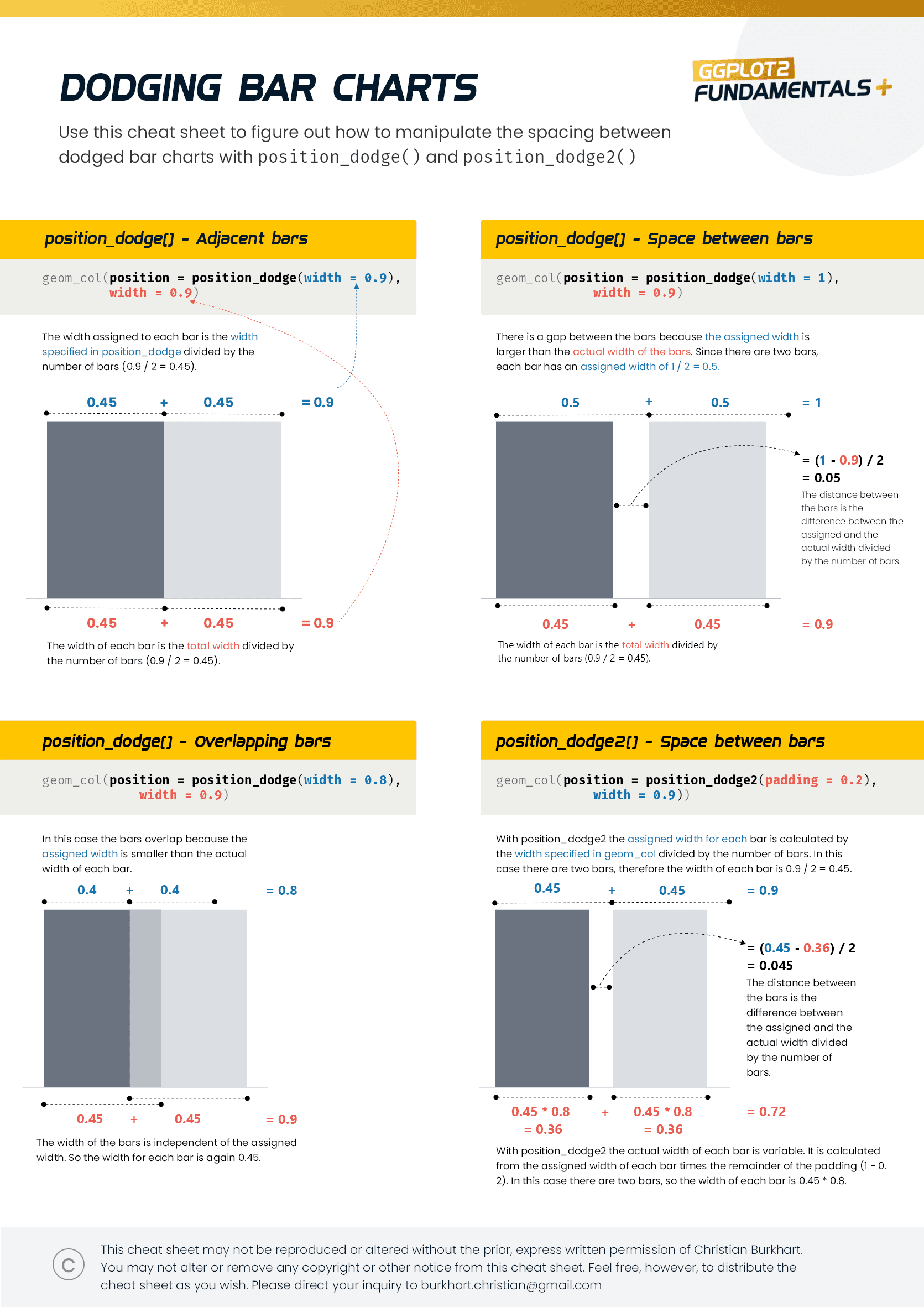
Typical problems: 01 - Dodging bar charts8 min
Typical problems: 02 - Dodging bar charts5 min
Typical problems: Ordering of discrete variables (e.g. bar charts)6 min
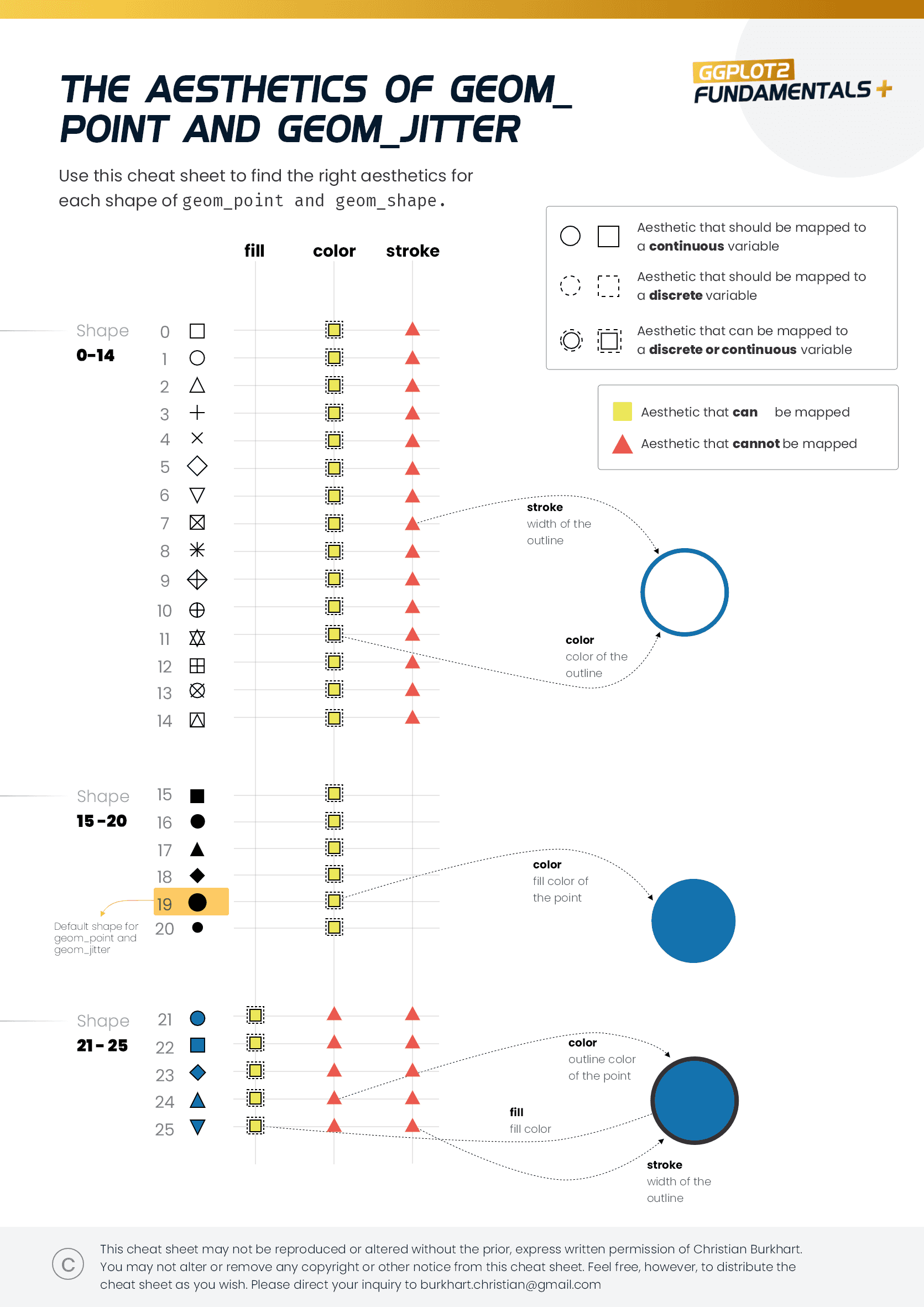
Typical problems: The aesthetics of geom_point and geom_jitter7 min
Exercise: Development of renewable energies3 min
Exercise: Birth rate in China4 min
Exercise: Obesity5 min
Best Practice Viz: Forest land4 min
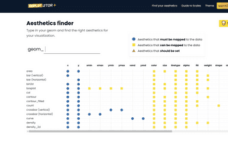
ggplot2tor - Aesthetics app9 min
Module 5
Scales
In this module we will talk about Scales. Scales are used to translate data into aesthetics. With the help of cheat sheets and a detailed web app we will understand scales better.
Introduction to scales7 min
The five types of scales9 min
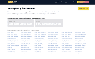
A complete guide to scales15 min
x/y scales - Limits5 min
x/y scales - Breaks and minor breaks8 min
x/y scales - Labels5 min
x/y scales - Scales package9 min
Color/fill scales - Part One10 min
Color/fill scales - Part Two5 min
Color/fill scales - Part Three10 min
Color/fill scales - Part Four5 min
Working with date, datetime, and time11 min
Exercise 15 min
Exercise 26 min
Exercise 34 min
Exercise 43 min
Exercise 56 min
Exercise 65 min
Best Practice Viz - Internet Usage11 min
Best Practice Viz - Renewable Energies8 min
Best Practice Viz - Forest Land4 min
Best Practice Viz - Life Expectancy4 min
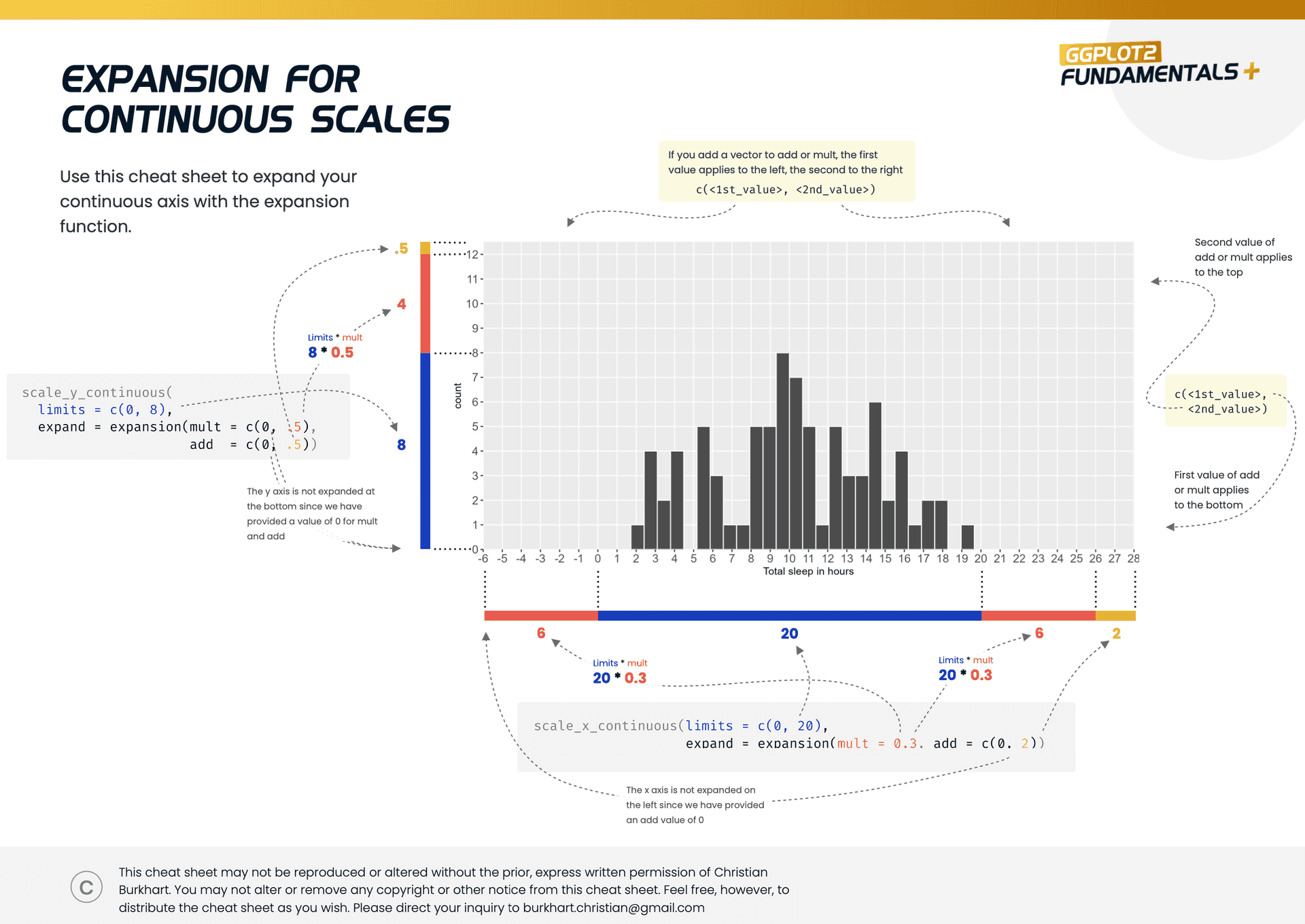
Bonus: How to expand continuous axes11 min
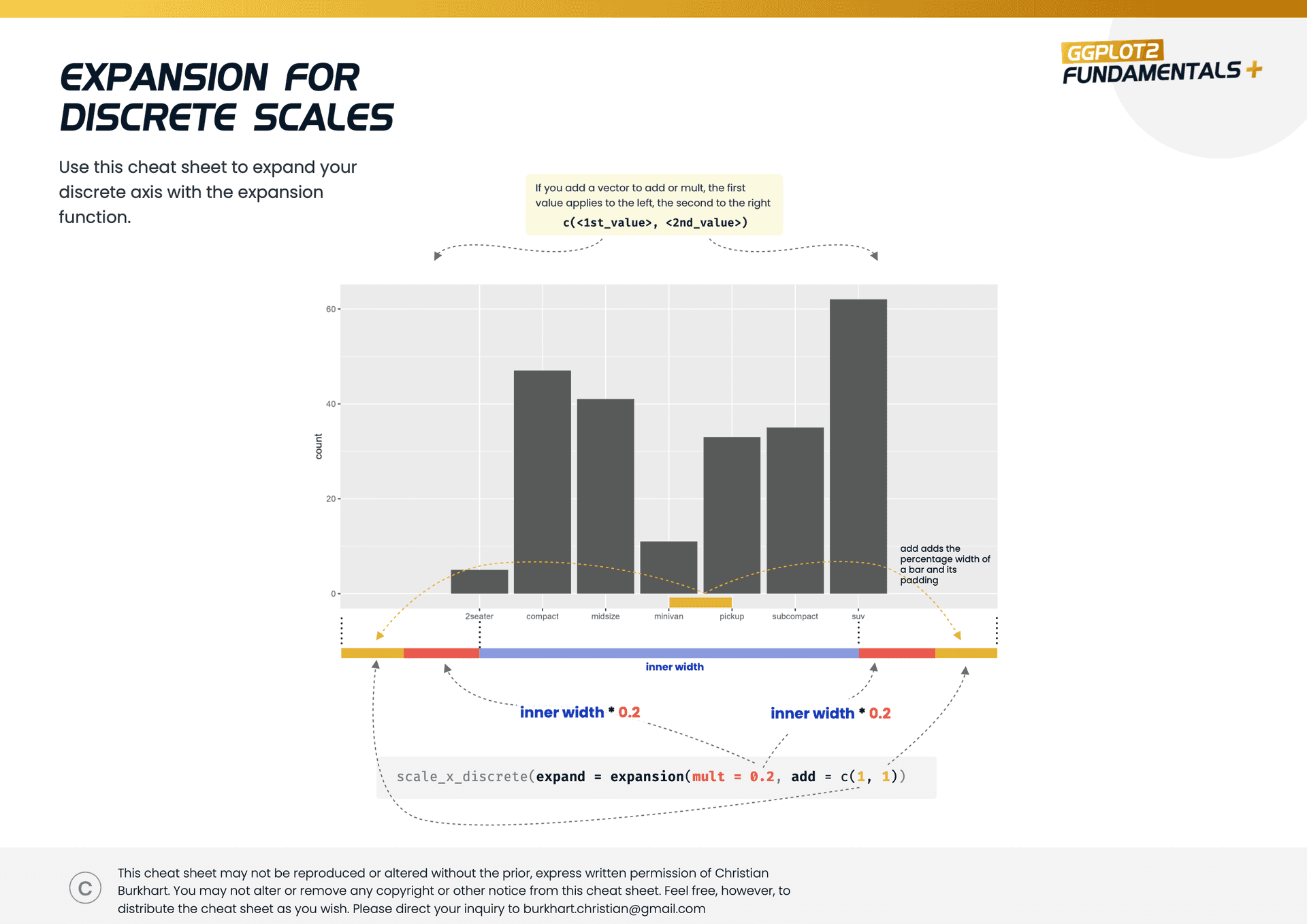
Bonus: How to expand discrete axes5 min
Module 6
Faceting
In this module, we will learn to create multiple visualizations based on discrete variables through faceting.
Introduction to faceting5 min
facet_wrap8 min
Free scales or not?5 min
facet_grid4 min
Ordering of panels4 min
Showing all geometric objects in the panels7 min
Dealing with continuous variables6 min
Best Practice Viz - Life Expectancy2 min
Module 7
Summary statistics
In this module, we will learn to perform various calculations on the data and plot them using summary statistics. Among other things, we will learn how to plot measures of center and spread.
Introduction4 min
Hidden summary statistics in ggplot23 min
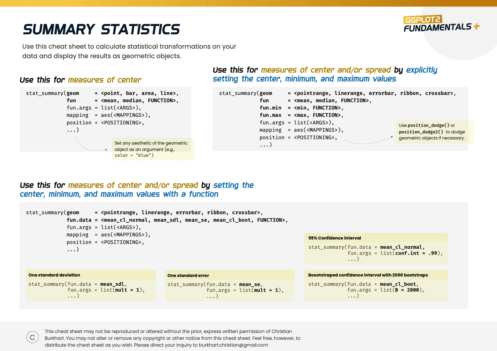
The stat_summary function11 min
How to plot measures of center10 min
How to plot measures of spread - Part one8 min
How to plot measures of spread - Standard deviation, standard error, and confidence intervals9 min
Combining stat_summary functions6 min
Best Practice Viz - Life Expectancy6 min
Module 8
Theme
In this module we will learn to visually modify our plots using the theme function.
Why theme?5 min
Pre-defined themes6 min
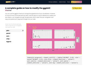
Theme categories9 min
Theme elements3 min
element_rect4 min
element_line4 min
element_text - labels2 min
element_text13 min
element_blank2 min
Tip: Adding a margin around the plot3 min
Tip: Use str_wrap to add line breaks to your text9 min
Tip: Improve your grid lines5 min
Tip: Write geom and theme text in the same size2 min
Tip: Designing the strip4 min
Tip: Designing the legend - part one8 min
Tip: Designing the legend - part two10 min
Tip: Create your own theme5 min
Best Practice Viz - Life Expectancy16 min
Best Practice Viz - Renewable Energies7 min
Best Practice Viz - Internet Usage11 min
Best Practice Viz - Forest Land8 min
Module 9
Level-up! Two
In the last module we will discuss numerous tips and tricks to improve your plots even more.
Mathematical notations8 min
Annotations12 min
Adding p-values to bar charts5 min
Adding regression lines to scatterplots3 min
Drawing functions and sampling distributions7 min
Creating variables on the fly7 min
Adding labels to lines7 min
Combining plots7 min
Export plots to high quality6 min
Best practice viz - Life expectancy12 min
Best practice viz - Renewable energies16 min
Best practice viz - Internet usage8 min
Best practice viz - Forest land3 min
Packed with
Free bonus material
8 new cheat sheets
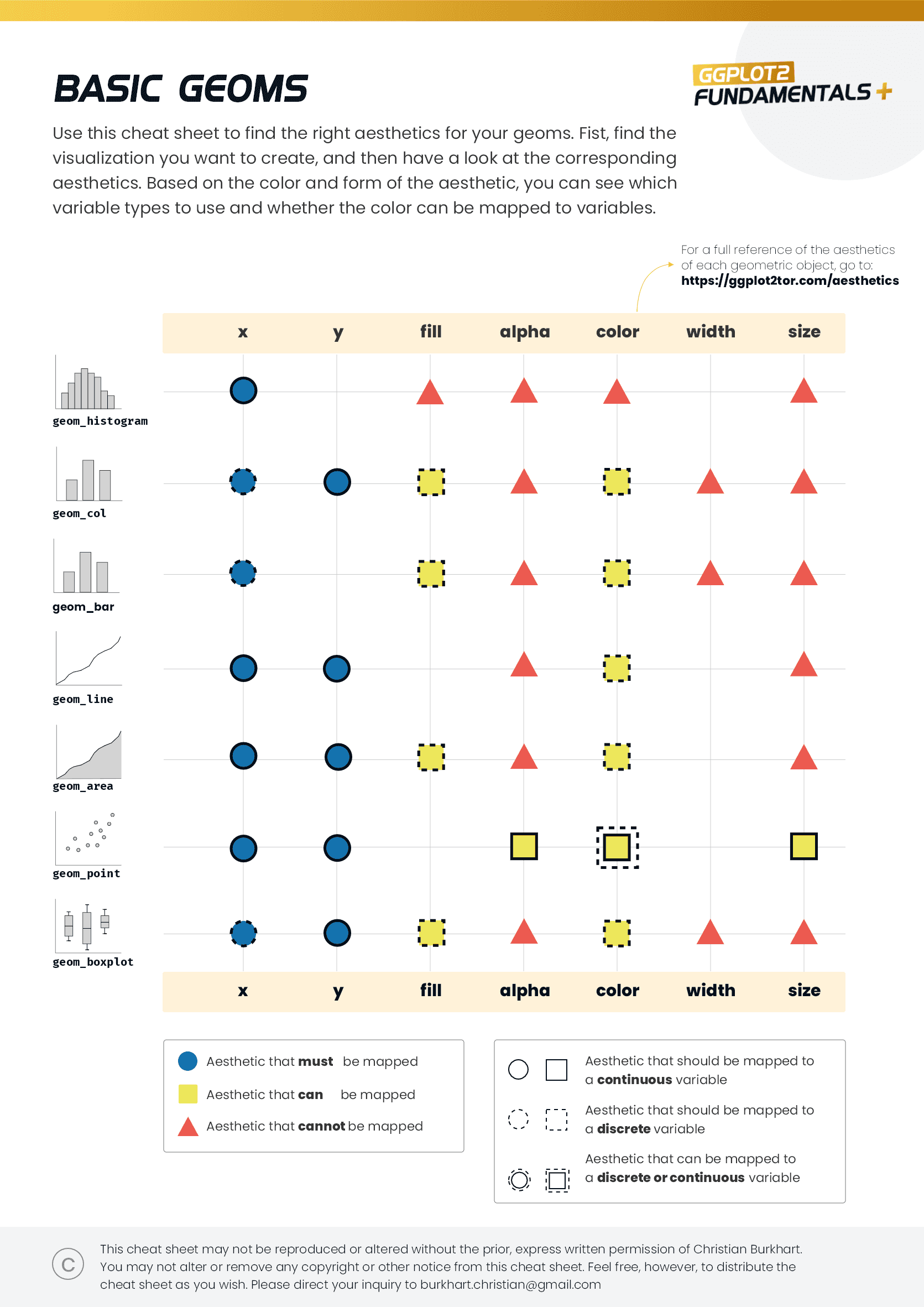
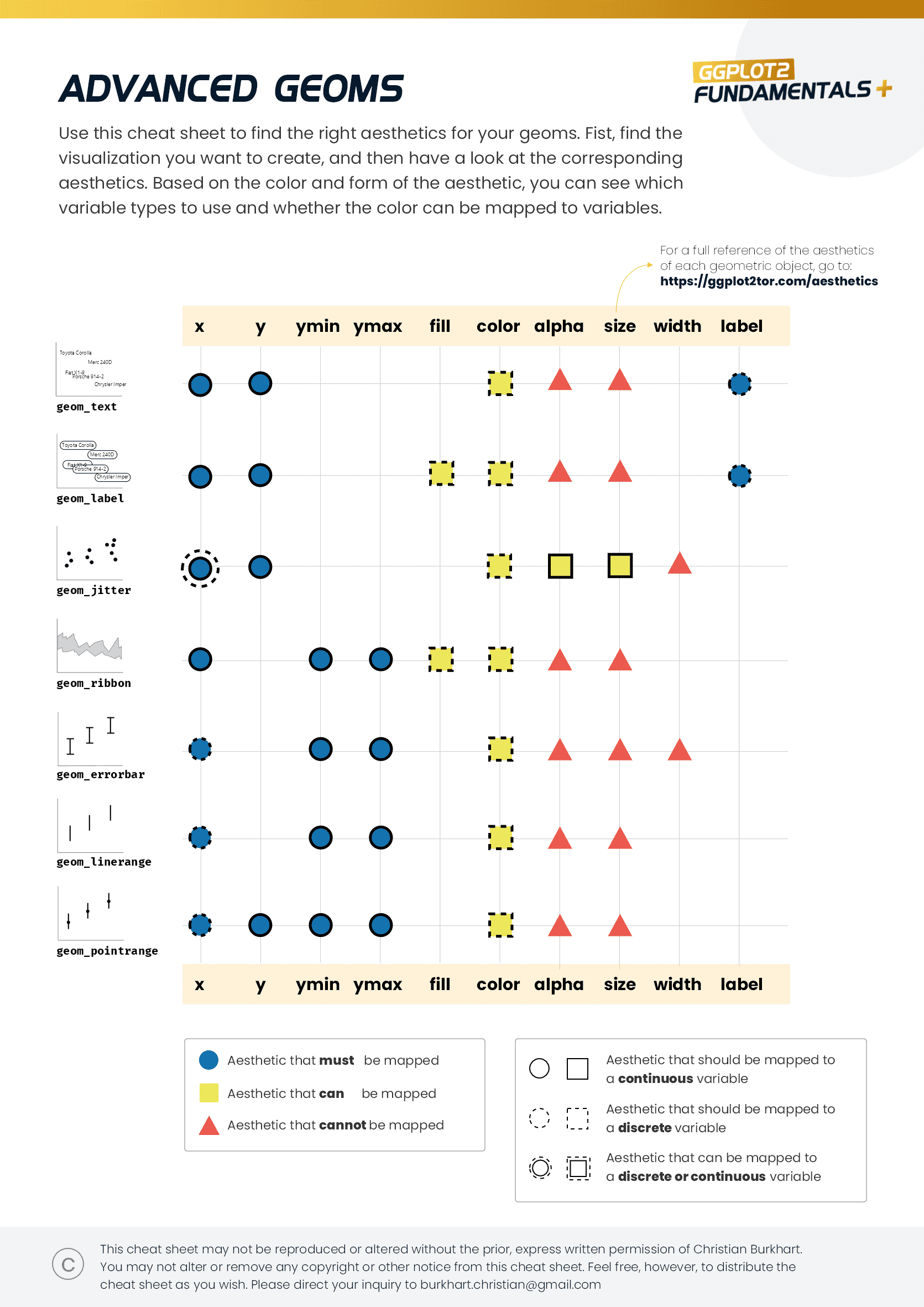
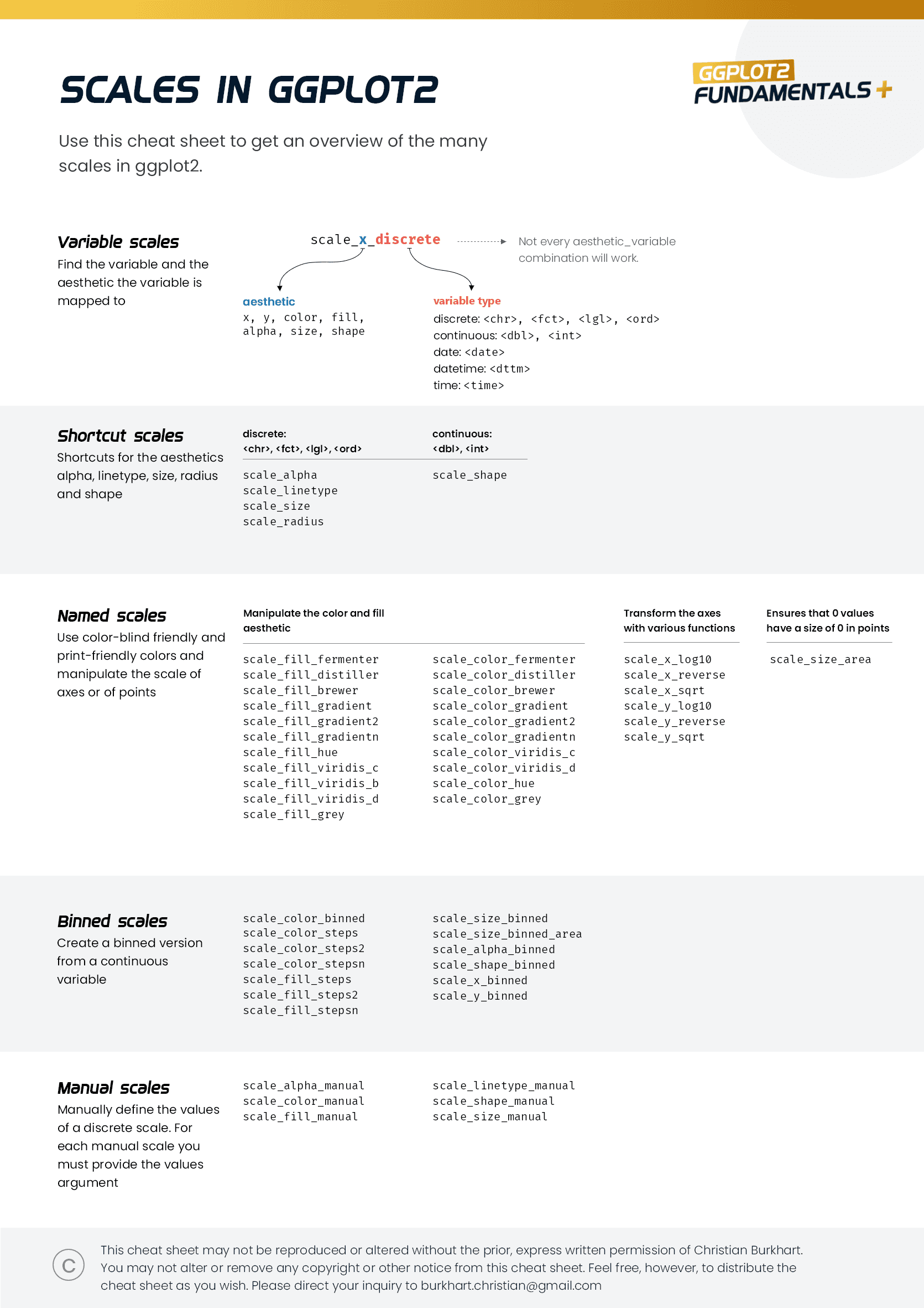
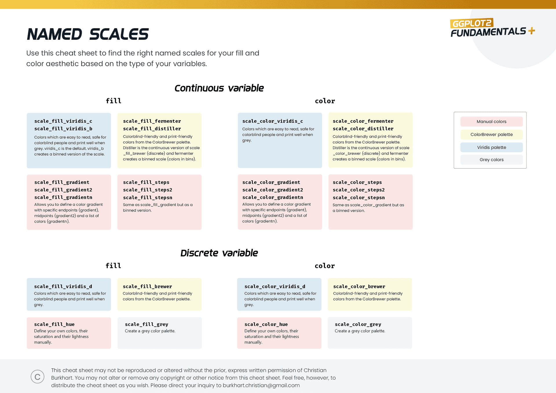
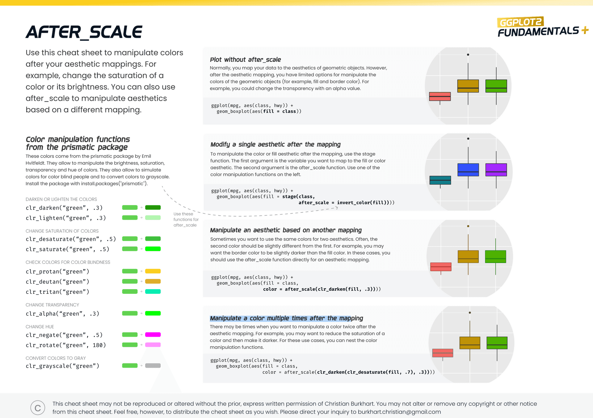
To help you on your ggplot2 journey, I have created 8 brand-new cheat sheets that help you to grasp the most fundamental concepts. You won't find similar cheat sheets anywhere else on the internet and best of all, they are free even if you don't sign up for the course.
A complete training course for ggplot2.
9 modules
11+ hours of videos
8 cheat sheets
3 web apps
Full source code
Unlimited updates

Hi, I am Christian and created this course!
I am an Instructional Designer by training and a self-trained Data Scientist. I currently live in Munich, Germany, and work as a Senior Instructional Designer for an artificial intelligence company. I spend most of my time creating educational materials.
My journey to data and programming began 10 years ago. Since I was a student I was passionate about R and had fun working with data. Over the years, I became particularly passionate in data visualization and the ggplot2 package. During my PhD ggplot2, the tidyverse and web development became my bread and butter and I gained extensive experience in the R environment.
My goal is to make you a better data scientist. See you around!
ggplot2tor
Tutorials, educational apps, cheat sheets and courses for you to master ggplot2
Creator and author
I am an Instructional Designer and a former educational scientist with a curiosity for web development and data visualization. Find me on my personal homepage or LinkedIn.

