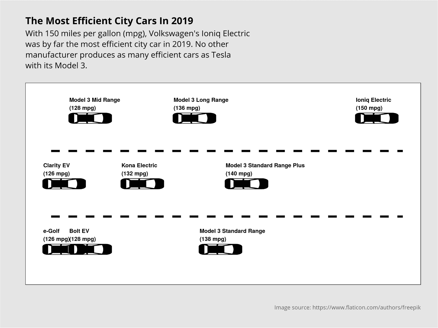
Sometimes an image says more than a thousand words. Or should I say, sometimes an image says more than a barchart or a histogram. Take Georgios Karamanis for example, who managed to visualize the most efficient car brands by depicting the brands as cars on a street. The position of cars on a street brings up certain associations. The foremost car is usually the fastest or best car. The last car is usually the loser. We can use such associations by using the position of cars as a ranking order, for example to visualize the most efficient cars in a given year. This is exactly what we try to do in this tutorial using this week's tidytuesday dataset. This tutorial is heavily inspired by the work of Georgios Karamanis, who did an awesome job with his visualization and gave me the idea for this article.
Let's grab the data first and have a look at it:
library(tidyverse)
library(ggimage)

big_epa_cars <- readr::read_csv(paste0("https://raw.githubusercontent.com/",
"rfordatascience/tidytuesday/master/data/2019/2019-10-15/big_epa_cars.csv")colnames(big_epa_cars) [1] "barrels08" "barrelsA08" "charge120" "charge240" "city08" "city08U" "cityA08" "cityA08U"
[9] "cityCD" "cityE" "cityUF" "co2" "co2A" "co2TailpipeAGpm" "co2TailpipeGpm" "comb08"
[17] "comb08U" "combA08" "combA08U" "combE" "combinedCD" "combinedUF" "cylinders" "displ"
[25] "drive" "engId" "eng_dscr" "feScore" "fuelCost08" "fuelCostA08" "fuelType" "fuelType1"
[33] "ghgScore" "ghgScoreA" "highway08" "highway08U" "highwayA08" "highwayA08U" "highwayCD" "highwayE"
[41] "highwayUF" "hlv" "hpv" "id" "lv2" "lv4" "make" "model"
[49] "mpgData" "phevBlended" "pv2" "pv4" "range" "rangeCity" "rangeCityA" "rangeHwy"
[57] "rangeHwyA" "trany" "UCity" "UCityA" "UHighway" "UHighwayA" "VClass" "year"
[65] "youSaveSpend" "guzzler" "trans_dscr" "tCharger" "sCharger" "atvType" "fuelType2" "rangeA"
[73] "evMotor" "mfrCode" "c240Dscr" "charge240b" "c240bDscr" "createdOn" "modifiedOn" "startStop"
[81] "phevCity" "phevHwy" "phevComb" The goal of this visualization is to show the most efficient cars of the year 2019. For this we need the variables year, city08 and model. city08 indicates how many gallons the car consumes per mile. model denotes the name of the car. Next we try to filter all cars of the year 2019 out of the data set and display the variable city08 on the X-axis. The Y-axis has no special meaning and only marks the lanes of the road.
Data preparation
Since each car occurs several times in the dataset and is probably available in different variations, we have to group the cars and calculate the mean value of their consumption. At the same time, we are not interested in all cars, but only in the 9 most efficient ones. One challenge is to visualize the cars in different lines and to give the cars a suitable label.
(efficient_cars_2019 <- big_epa_cars %>%
  filter(year == 2019) %>%
  group_by(model) %>%
  summarise(mean = mean(city08, na.rm = TRUE)) %>%
  arrange(desc(mean)) %>%
  slice(1:9) %>%
  mutate(
    line = rep(c(3, 2, 1), 3),
    label = paste0(model, "\n(", round(mean, 2), " mpg)")
  ))
# A tibble: 9 x 4
model mean line label
<chr> <dbl> <dbl> <chr>
1 Ioniq Electric 150 3 "Ioniq Electric\n(150 mpg)"
2 Model 3 Standard Range Plus 140 2 "Model 3 Standard Range Plus\n(140 mpg)"
3 Model 3 Standard Range 138 1 "Model 3 Standard Range\n(138 mpg)"
4 Model 3 Long Range 136 3 "Model 3 Long Range\n(136 mpg)"
5 Kona Electric 132 2 "Kona Electric\n(132 mpg)"
6 Bolt EV 128 1 "Bolt EV\n(128 mpg)"
7 Model 3 Mid Range 128 3 "Model 3 Mid Range\n(128 mpg)"
8 Clarity EV 126 2 "Clarity EV\n(126 mpg)"
9 e-Golf 126 1 "e-Golf\n(126 mpg)" To get the cars on different lines, we used the function rep. With rep we can repeat vectors as often as we want. In this example we repeat the vector c(3, 2, 1) three times. This way we distribute the cars so that they do not overlap if possible. We also use the function paste0 to create a label which describes the car and in a new line the consumption of the car. To jump to the new line, we use the symbol \n.
First visualization
In the first plot we use the function geom_image of the package ggimage to place the cars in our visualization:
efficient_cars_2019 %>%
  ggplot(aes(mean, line)) +
  geom_image(aes(image = "icon_rotate.png"),
size = 0.11, asp = 1) 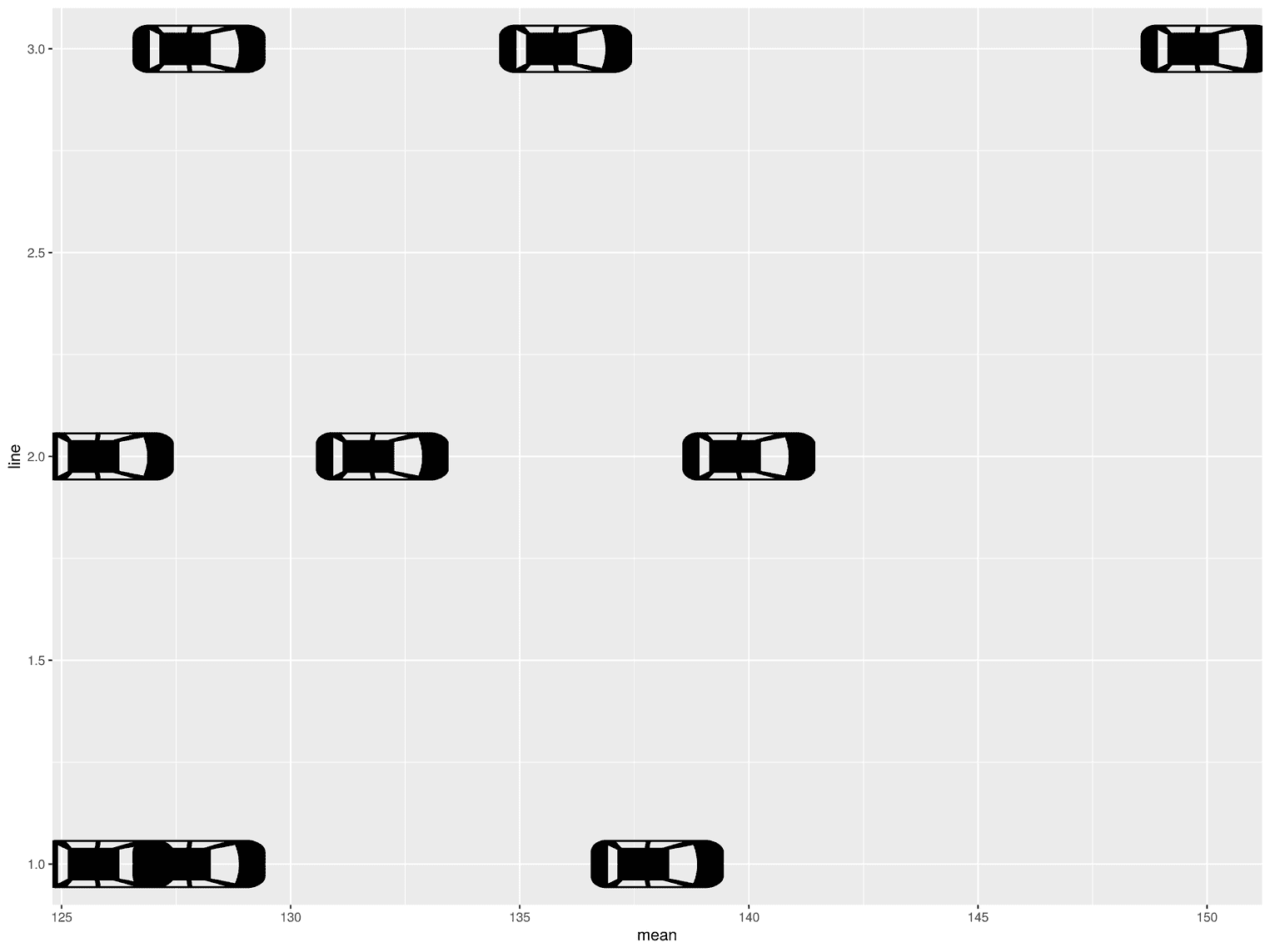
The visualization is not yet readable at this point, as the readers would not understand why the cars are placed in this way and what the position of the cars represents.
Add the car labels and adjust the y axis
To improve readability, we next place a label over the cars and change the y-axis so that there is more free space before the first car and after the last:
efficient_cars_2019 %>%
  ggplot(aes(mean, line)) +
  geom_image(aes(image = "icon_rotate.png"),
             size = 0.11, asp = 1) +
  geom_text(aes(label = label), nudge_y = 0.22, hjust = 0,             nudge_x = -1.6,            fontface= "bold") +  scale_y_continuous(limits = c(0.6, 3.4))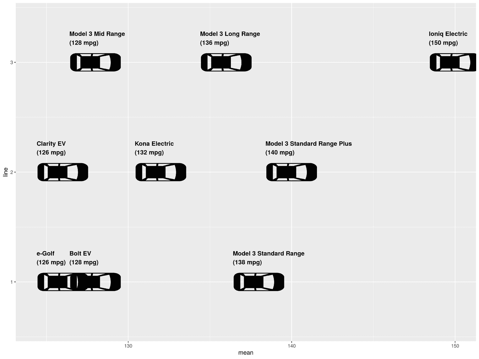
Using geom_text we add the label we created in the variable label before. To start the text left justified we set the argument hjust to 0. Additionally we move the label with nudge_y a little to the left. With the help of scale_y_continuous we determine the limits of the y-axis. With limits you define where the y-axis should start and where it should end.
Add title, subtitle, caption
Since the picture of the car does not come from me, but from the website flaticon, we have to give credits for it. We also need a title and a subtitle to describe to the readers what they see in the visualization.
efficient_cars_2019 %>%
  ggplot(aes(mean, line)) +
  geom_image(aes(image = "icon_rotate.png"),
             size = 0.11, asp = 1) +
  geom_text(aes(label = label), nudge_y = 0.22, hjust = 0,
            nudge_x = -1.6,
            fontface= "bold") +
  scale_y_continuous(limits = c(0.6, 3.4)) +
labs( title = "The Most Efficient City Cars In 2019", subtitle = paste0("With 150 miles per gallon (mpg), Volkswagen's Ioniq Electric\n", "was by far the most efficient city car in 2019. No other\n", "manufacturer produces as many efficient cars as Tesla\n", "with its Model 3."), x = "", y = "", caption = "Image source: https://www.flaticon.com/authors/freepik" ) 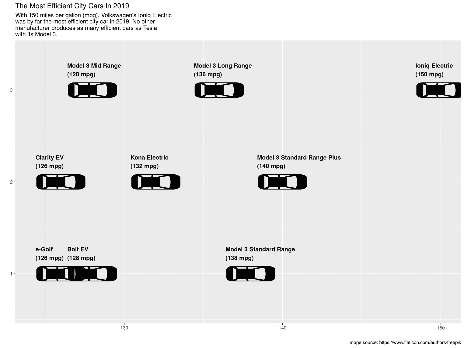
At this point the readers could already understand the visualization, but it does not yet look very appealing. For example, the street lines are missing and the background of the visualization does not represent a street.
Create street effect
To realize the effect of a street, we use a very simple trick. We insert two dashed lines into the visualization. Since we know that the cars are placed at positions 1, 2 and 3 on the road, we can add two dashed lines at positions 1.5 and 2.5:
efficient_cars_2019 %>%
  ggplot(aes(mean, line)) +
  annotate("segment", x = 125, xend = 152, y = 1.5,            yend = 1.5, color = "black", size = 2,           linetype = "dashed") +  annotate("segment", x = 125, xend = 152, y = 2.5,            yend = 2.5, color = "black", size = 2,           linetype = "dashed") +  geom_image(aes(image = "icon_rotate.png"),
             size = 0.11, asp = 1) +
  geom_text(aes(label = label), nudge_y = 0.22, hjust = 0,
            nudge_x = -1.6,
            fontface= "bold") +
  scale_y_continuous(limits = c(0.6, 3.4)) +
  labs(
    title = "The Most Efficient City Cars In 2019",
    subtitle = paste0("With 150 miles per gallon (mpg), Volkswagen's Ioniq Electric\n",
                      "was by far the most efficient city car in 2019. No other\n",
                      "manufacturer produces as many efficient cars as Tesla\n",
                      "with its Model 3."),
    x = "",
    y = "",
    caption = "Image source: https://www.flaticon.com/authors/freepik"
) 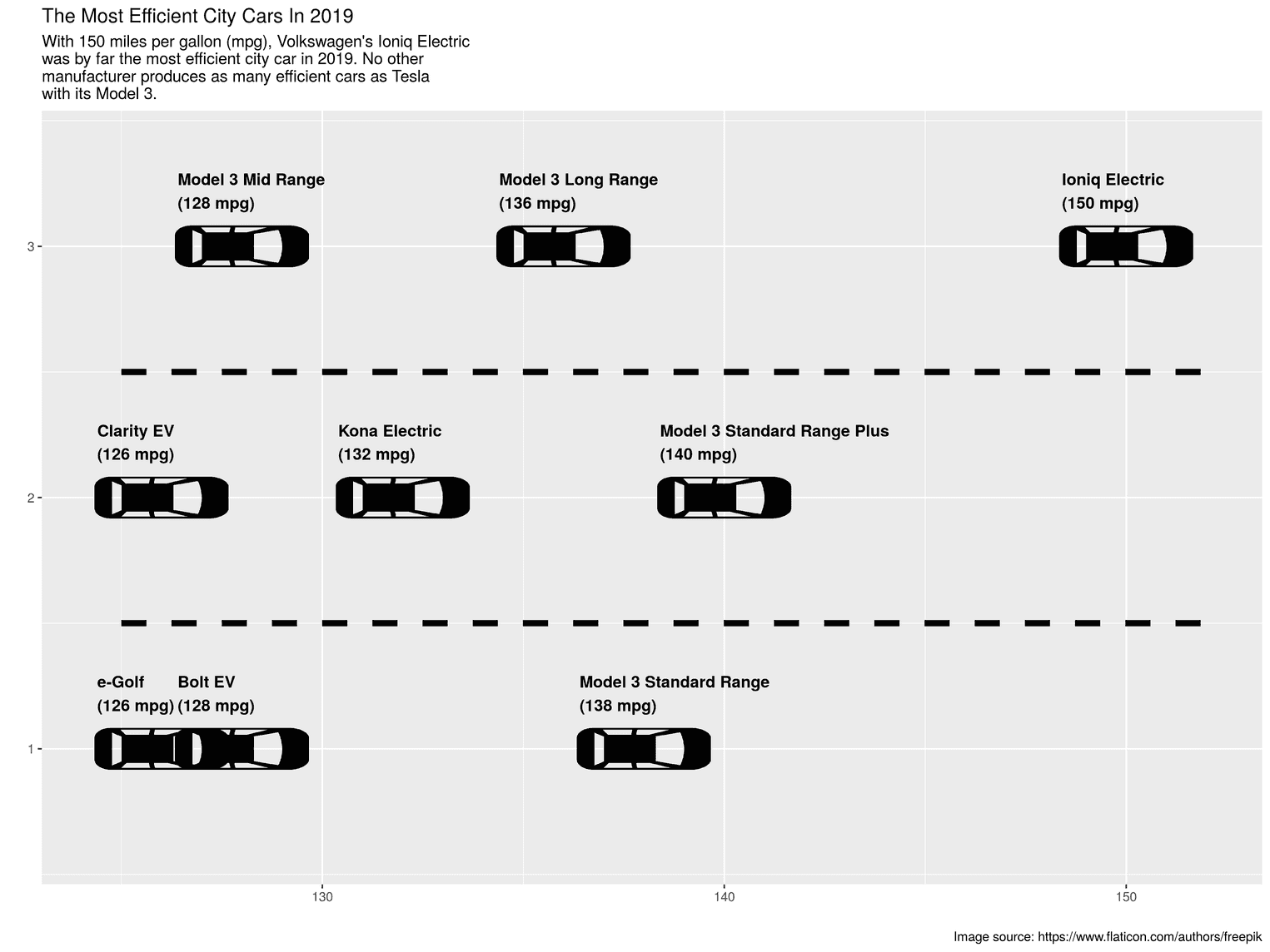
You always use the function annotate if you want to insert graphical things into the visualization that are not part of the data themselves. For example a specific label or in our case the street lines. The first argument of the function is the type of visualization. I first made the mistake of writing line as an argument until I found out that segment is the right name to add a line.
Change background colors
In order to create an even stronger impression of a street, the next step is to change the background of the visualization. I've decided to keep this visualization relatively simple, and like to try out other colors that will make the visualization even more appealing to you.
efficient_cars_2019 %>%
  ggplot(aes(mean, line)) +
  annotate("segment", x = 125, xend = 152, y = 1.5,
           yend = 1.5, color = "black", size = 2,
           linetype = "dashed") +
  annotate("segment", x = 125, xend = 152, y = 2.5,
           yend = 2.5, color = "black", size = 2,
           linetype = "dashed") +
  geom_image(aes(image = "icon_rotate.png"),
             size = 0.11, asp = 1) +
  geom_text(aes(label = label), nudge_y = 0.22, hjust = 0,
            nudge_x = -1.6,
            fontface= "bold") +
  scale_y_continuous(limits = c(0.6, 3.4)) +
  labs(
    title = "The Most Efficient City Cars In 2019",
    subtitle = paste0("With 150 miles per gallon (mpg), Volkswagen's Ioniq Electric\n",
                      "was by far the most efficient city car in 2019. No other\n",
                      "manufacturer produces as many efficient cars as Tesla\n",
                      "with its Model 3."),
    x = "",
    y = "",
    caption = "Image source: https://www.flaticon.com/authors/freepik"
  ) +
  theme(    plot.background = element_rect(fill = "#e5e5e5"),    panel.background = element_rect(fill = "white", color = "black"),    axis.text = element_blank(),    axis.ticks = element_blank(),    panel.grid = element_blank()  )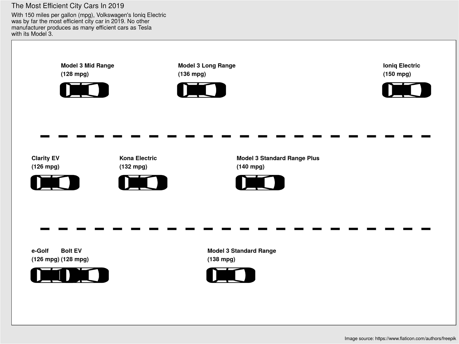
To change design aspects of the visualization, you can always use the theme function. In this case we used the background with the arguments plot.background and panel.background. With panel.background you can change the background of the area between the axes, not the background of the whole visualization. In addition, with axis.text and axis.ticks we have removed the axis labels and the small ticks on the axes.
Polish visualization
In the last step we change the size of the font and the spacing between the elements:
efficient_cars_2019 %>%
  ggplot(aes(mean, line)) +
  # Previous code goes here
  theme(
    plot.margin = unit(rep(1.2, 4), "cm"),
    text = element_text(family = "Open Sans"),    plot.background = element_rect(fill = "#e5e5e5"),
    plot.title = element_text(size = 19,                               face = "bold",                              color = "black",                              margin = margin(b = 8)),    plot.subtitle = element_text(size = 16,                                  lineheight = 1.1,                                 color = "black",                                 margin = margin(b = 25)),    panel.background = element_rect(fill = "white", color = "black"),
    plot.caption = element_text(size = 11,                                margin = margin(t = 25),                                color = "#666666"),    axis.text = element_blank(),
    axis.ticks = element_blank(),
    panel.grid = element_blank()  )
Using the arguments plot.title, plot.subtitle and plot.caption we change the text for the title, subtitle and caption. No surprise here :) To give the whole text a different font, we can use the argument text. Finally, we remove all grid lines with panel.grid and element_blank(). element_blank() can be used for any element you don't want to display.
