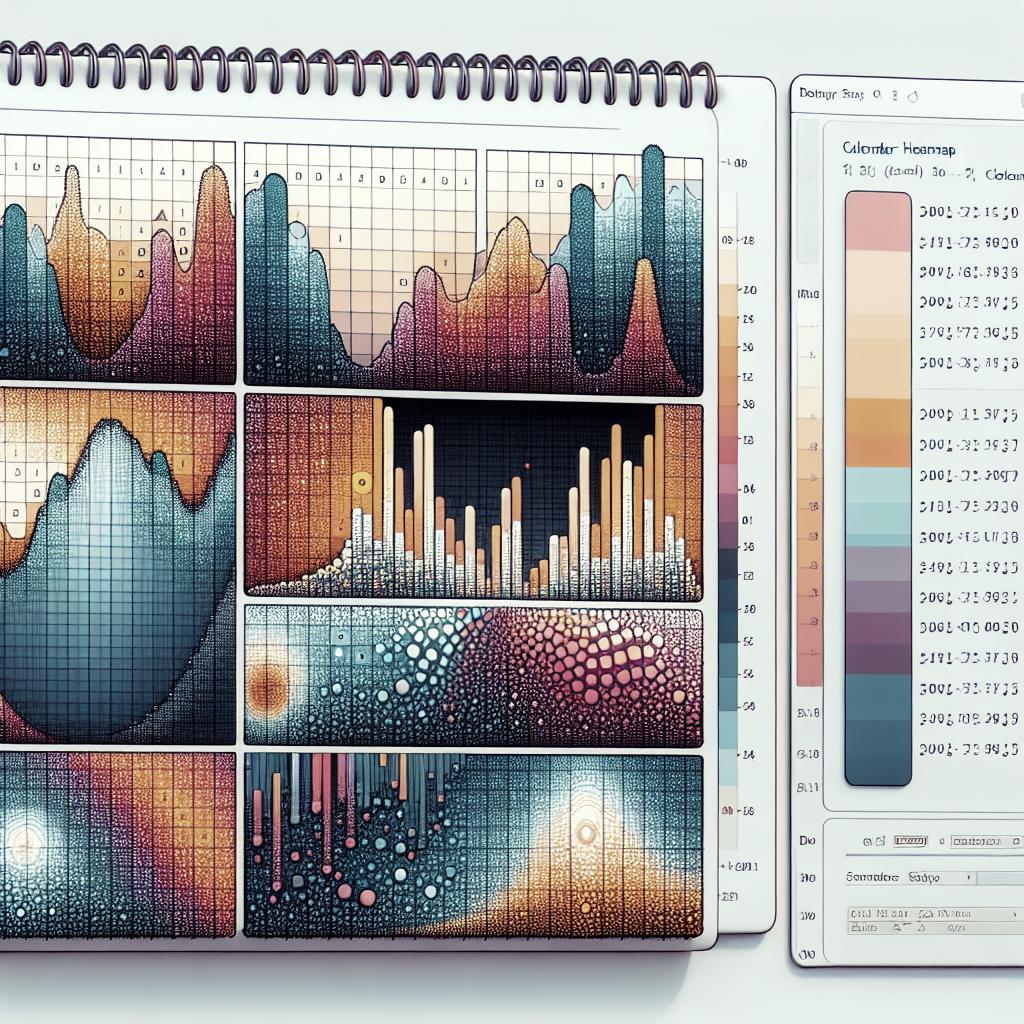
Calendar Heatmaps with ggplot2
Calendar heatmaps are a fantastic way to visualize time-based data, displaying data density by calendar dates. Using the powerful ggplot2 library in R, users can create sophisticated and informative visuals that reveal patterns over time. This blog post explores the creation of calendar heatmaps using ggplot2, detailing necessary packages and key functions, such as
scale_fill_distiller
and
facet_grid
. We’ll delve into practical steps for crafting these plots, highlighting their value for data visualization enthusiasts. Lessons learned from constructing these heatmaps will provide insight into effectively communicating temporal data through engaging visuals.
scale_fill_distiller
Reasons and inspiration
One of the reasons for using
scale_fill_distiller
is its flexibility in coloring options, which allows you to map colors to data in various aesthetic ways. It’s particularly useful when dealing with continuous data, as it supports palettes that range smoothly from one color to another. This helps in highlighting nuances and gradients within your calendar heatmap.
Inspired by traditional heatmaps, the use of
scale_fill_distiller
can add an extra layer of professionalism and precision to your visuals. By using predefined color palettes, you can effectively communicate data magnitude and distribution while maintaining stylistic consistency across your graphs.
Requirements
Before diving into creating calendar heatmaps, ensure you have the necessary setup. You’ll need R installed, along with the ggplot2 package. Additionally, supporting packages such as lubridate for date manipulation, and dplyr for data manipulation, can streamline the preprocessing steps required for effective heatmap creation.
Having a clean dataset, where dates are properly formatted, will facilitate easier plotting. Ensure your dataset contains a ‘date’ field and another column with the values you want to visualize on the calendar heatmap. Having this structure ready is crucial for seamless plotting in R.
facet_grid
Going to work
Once your dataset is prepared, you can begin plotting with the function
facet_grid
in ggplot2. This function allows for the segregation of your data into different panels or facets, making it an excellent choice when displaying data across multiple years or comparing different datasets within the same plot.
Using
facet_grid
enhances readability and interpretation of the heatmap by clearly distinguishing between different subsets of data. It’s a powerful tool for comparative analysis, allowing users to spot trends and deviations between different time periods easily.
Plots
To create plots, map your data onto a grid using ggplot2. Start by specifying your axes, usually with dates on one axis and another time-related metric on the other. Apply the
geom_tile()
function to fill in the calendar, coupled with
scale_fill_distiller()
to apply your chosen color gradient.
Facetting is achieved with
facet_grid
, which enables you to visualize multiple calendars side by side. Adjust theme settings to improve the readability of your plots, ensuring that labels and color gradients are conspicuous and meaningful to interpret.
Related
Trends and Insights
Calendar heatmaps are an insightful tool in data analysis, offering a visual perspective that’s often more immediately comprehensible than bar or line plots. They allow for the identification of patterns, trends, and anomalies across extended periods that may otherwise go unnoticed in raw datasets or different graph forms.
These heatmaps have gained traction in various fields, from analyzing web traffic and user engagement to tracking financial transactions or seasonal sales trends. Their versatility in visual storytelling makes them a favored choice among data analysts and scientists.
Further Resources
If you’re new to ggplot2 or want to extend your capabilities further, several resources can aid your journey. Comprehensive tutorials on R and ggplot2 are available on platforms like Coursera, DataCamp, and R-bloggers. Additionally, the ggplot2 book by Hadley Wickham is a must-read for understanding the philosophy and mechanics behind ggplot2 plotting.
Online communities such as Stack Overflow provide valuable support, where you can engage with other users, seek advice, and solve any challenges you encounter when creating your calendar heatmaps.
Lessons Learned
| Key Component | Description | Application |
|---|---|---|
|
Provides elegant color gradients for continuous data. | Improved visual representation of magnitude and trends. |
|
Creates separate grids for subsets of data. | Facilitates comparative analysis across different time frames. |
| Data Preparation | Essential step for smooth plotting and visualization. | Ensures data is structured and ready for ggplot2 operations. |
| Resources and Support | Utilizing online platforms and literature for extended learning. | Helps in overcoming challenges and gaining advanced plotting skills. |

