Creating Plots with Tidyverse in R
Data visualization is an essential tool in the arsenal of data analysts and data scientists alike. With R, a prominent programming language for statistical computing, creating visual representations of data becomes intuitive and impactful, especially with the tidyverse package. This blog post will walk you through the process of creating plots using tidyverse, focusing on pair plots. We will break down the steps into comprehensible sections: starting with dataset preparation, followed by methods of creating pair plots, and finally exploring advanced functionalities using the ggpairs function. By the end of this post, you’ll have the knowledge to transform data into meaningful insights using beautifully constructed visualizations in R.
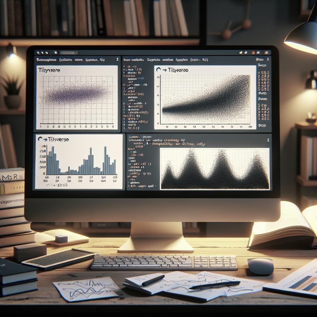
Pair Plot Using Tidyverse in R
The pair plot, otherwise known as scatterplot matrix, is a straightforward yet powerful visualization tool. It allows you to examine the relationships between multiple variables simultaneously, providing a consolidated view of data associations. In the tidyverse, creating a pair plot can be both simple and adaptable, thanks to the versatile libraries within the collection.
These plots not only help in spotting trends and potential correlations but also serve as a quick overview of data consistency and distribution. For data enthusiasts and professionals, such visualizations are crucial during the exploratory data analysis (EDA) phase, assisting in the decision-making process for data preparation and model selection strategies.
Leveraging the tidyverse for constructing pair plots transforms the plotting experience, making it smoother and more streamlined. With tidyverse’s principles of data manipulation, you can efficiently create plots that are not only visually appealing but rich in insight.
R
Step 1: Preparing the Dataset
Before diving into plotting, having a well-structured and clean dataset is paramount. In R, data preparation often involves cleaning up missing values, normalizing the data structure, and selecting relevant features. This process serves as the foundation for any meaningful analysis and plot creation.
Using tidyverse functions like dplyr, you can filter and manipulate datasets, achieving a form that best represents the questions you aim to answer. Categorical data can be transformed into factors, numerical columns can be scaled, and the overall tidiness of the dataset can be enhanced through functions like select(), filter(), and mutate().
The better prepared your dataset is, the more robust and accurate your pair plots will be. A dataset that’s ready to be plotted allows for a smooth transition into the visualization phase, ensuring that any insights derived are based on quality data.
R
Step 2: Create the Pair Plot
Once your dataset is ready, it’s time to create the pair plot. One of the most straightforward methods in R is utilizing the pairs() function. This base R function allows you to visualize a matrix of scatterplots, providing a glimpse into the relationships between different variables. While not as customizable as ggplot2 functions, it serves as a quick introduction for beginners.
The pairs() function plots all variable combinations from a dataset in a matrix-like pattern, making it easier to visualize all potential correlations at once. However, for those looking to create more aesthetically pleasing and functionally comprehensive plots, ggpairs from the GGally package offers additional control and customization.
In whether to opt for simplicity or detail, it’s essential to understand your audience and the goals of your analysis. Knowing which plot function to use keeps your visualization focused and enhances the overall interpretability of your data.
R
Example 2:
Let’s dive into another example, where we’ll explore more possibilities with pair plots. Here, we will look at two distinct methods to enhance your visualization capabilities. This will guide you in selecting the most appropriate tools for your data examination needs.
The beauty of R lies in its ability to adapt to various analytical contexts, and with tidyverse’s ecosystem, users can effortlessly switch between plotting methods. Such flexibility proves essential when dealing with different datasets and varying analytical demands.
By comparing and contrasting distinct methods of creating pair plots, you gain a more comprehensive understanding of plotting alternatives, equipping you with the necessary skills to personalize your data stories.
R
Method 1: Using Simple pairs() Function
The pairs() function is a classic in R, known for its ease of use and speed. It enables the quick plotting of scatterplot matrices directly from a dataset, with minimal code required. Although it might lack aesthetic customization, it’s a great starting point for basic exploratory data analysis.
In R code, implementing the pairs() function could look something like this:
pairs(your_dataset)
. This one-liner generates a grid of scatterplots, offering an immediate visual summary of inter-variable relationships. Such functionality is perfect for rapid assessments when you need to evaluate data structure at a glance.
The pairs() function is good for straightforward needs, where functionality and speed take precedence over intricate design. It’s efficient for quick hypothesis-testing or generating insights within the initial phases of data exploration.
R
Method 2: Using ggpairs() Function
For those seeking more control over their visualizations, the ggpairs function from the GGally package in R is a powerful alternative. Building on the principles of ggplot2, ggpairs allows for extensive customization, including title adjustments, color schemes, and plotly interactivity.
Where pairs() falters in aesthetic appeal, ggpairs steps up by presenting a much more polished view of the same data. Utilizing
ggpairs(your_dataset)
involves more than just constructing scatterplots; you gain access to extensive labelling and design features that enhance the presentation of your analysis.
For complex datasets or when you need to make an impactful presentation, ggpairs provides a superior option. By enabling detailed customization, it conveys your findings more effectively, making it invaluable when conveying insights to stakeholders or in publication-quality graphics.
R
Similar Reads
If you’re intrigued by the power of R and tidyverse for data visualization, there are a multitude of additional resources and tools to further bolster your skills. Books like “R for Data Science” by Hadley Wickham & Garrett Grolemund offer deep dives into the tidyverse suite, enhancing your data manipulation and visualization capabilities.
Online courses and platforms can also augment your learning, providing a blend of theory and practical application. Solutions like DataCamp and Coursera present modules focusing on plotting techniques in R, fostering a more interactive and applied learning process.
Engaging with these resources keeps you ahead of data trends and deepens your expertise in data visualization, turning complex datasets into easily digestible and insightful graphics efficiently and effectively.
Future Prospects
| Step | Description | Tools Used |
|---|---|---|
| Dataset Preparation | Clean and structure data using tidyverse | dplyr, tidyr |
| Create Pair Plot with pairs() | Simple and rapid matrix of scatterplots | Base R |
| Create Pair Plot with ggpairs() | Advanced and customized plots | GGally, ggplot2 |
| Enhance Skills | Further learning through books and courses | DataCamp, Coursera |

